
It’s fair to say that I was nervous about a fair few things having graduated uni. Not least trying to find a job in the midst of a recession. But more than that - when I eventually did find a job, I was aware that this is potentially a very dangerous time in any architect-to-be’s life: when the university education ends and the pratical experience begins.
Now, while it's an expected turn to take as you progress through the ranks of architecture, I’ve always been struck by the discrepancy of these two educational models (at this stage I still consider practice to be an education). Having studied at two pretty conceptual schools and spent the majority of my work experience on design stages rather than construction, I’m left with a legacy of having very little knowledge or experience of the practical side of architecture. Personally I was happy to let this be the case and to give a disproportionate amount of time to design in my early years. However, I am aware that there is a balance to be struck between the conceptual and the practical; a good designer, after all, will be one who can see a strong concept through to completion. Without the ideas, the finished result is mundane; without excecution, the idea won’t work.
The source of my nervousness is that the move from uni to practice is, in my case at least, one from a world where it is possible to get away with useless beauty, to one where is it possible to get away with ugly utility. And neither world will tolerate the others’ vice well.
Take this design for a poly-propelyne sofa below as an example:
This was something I did on a train journey soon after finishing uni to practise some basic 3dmax. I was happy enough with the result and, I guess if I saw it in a reception foyer somewhere I might think it’s interesting and look twice. Mostly because I’d be curious for clues as to how they made it (a pretty vital step neatly ignored by rendering-without-prototyping).
But let’s be honest here: it’s nothing new. I’ve seen this stuff all over the place whether it be off-the-wall eco-city skyscrapers or blobby rapid-prototyped fruit bowls. It’s the kind of stuff that gets churned out as soon as there’s a surge in accessible manufacturing/designing methods like there has been over the last decade in CADCAM. In this case it’s not archetypal of a movement in any respect other than the disproportionate sense of achievement from what was essentially just lazy design. The fact I was happy with it was less about my motivation to design well and more about showing myself that I might be capable of producing the kind of stuff I see all around me. But the point here - and it's not a small one - is that it's bullshit. Dangerous, pretty, post-rationalised, indulgent bullshit.
For me, this represents exactly the direction I don't want to go in: the latest Gehry flashbang which arrests the eyes but leaks at the roof. Or a Zaha Building while looks amazing in Helen Binet's photos but ends up looking like this. So, with this in mind, I'm following the path of trying to educate myself in practice while stimulating the conceptual side with side projects. Tyring to strike a balance.
The first of these side projects was an installation called ELIS with an artist called Matthew Darbyshire. ELIS was a collaborative project with him, myself, Karen Eyre, Riya Patel and Foxhall Associates. Now, despite my best efforts, I don’t really consider myself down with the art kidz. Keeping up with architecture seems to take up all my time as it is. In this light, I have to admit I didn’t know of Matt before meeting him. Well, it turns out he is, as the art kids would say, the shizzle (having recently had his own solo show in the Hayward Gallery).
His work has quite a lot of conceptual overlap with architecture and this project even moreso. This idea was to close Herald St. Gallery in East London (where Matt is a resident artist) and wrap it in a hoarding advertising a hypothetical building. This building would be nonsense and an exagerated version of the kind of souless development that is currently exploding around this 2012 Olympics area. My task was to co-design this monstrosity and model/render it for the hoarding.
Now, in terms of design, the building was to be a mixture of Ballardian distopian self-contained 'community' and AHMM's method of surface-treating essentially tedious buildings with colour in order for it to appear somehow playful and New Labour.
Now, personally, I do have a certain respect for AHMM. In others' hands many of their projects would have turned out much worse and they are very good at what they do and the budgets they have. However, in terms of the final result I do think it's a trend worth criticising. (Though the fall-out when they saw this criticism was a sight to behold. But, for obvious reasons, I can't really expand on that here)
Each rendering was 2.2 x 2.2m at 300dpi. I'll include a couple of zoomed-in images so you can see some detail:
Overall shot: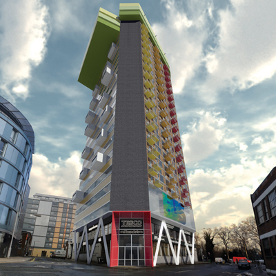
Classic elevation zoom-lens view: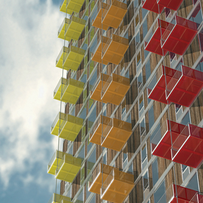
Detail: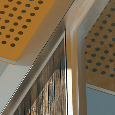
One of the sticky-out bits: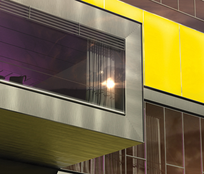
Detail: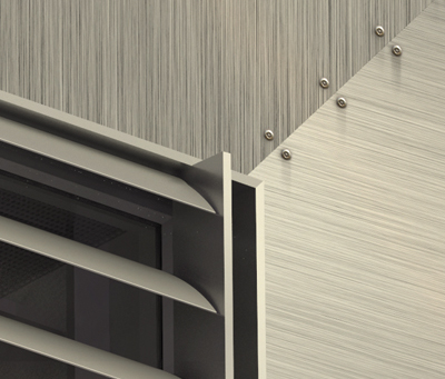
Section through the gym/bar/cinema: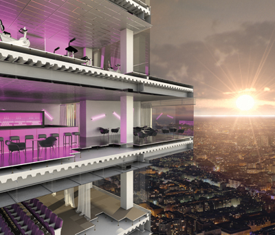
Detail: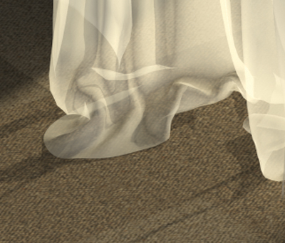
Detail: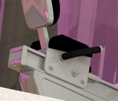
Detail:
Postscript:
If you're interested, you can find a couple of reviews here:
BD Online review
Guardian review
")
")
3 Comments
'a world where it is possible to get away with useless beauty, to one where is it possible to get away with ugly utility...'
i wonder...whether this is far too simplistic, polarised notion..
why does beauty have to be useless...is it not a a function in itself..? would you pick something ugly over something beautiful if you ever had the choice of two equals in all other factors....
and..isn't the most obvious solution not the most beautiful in its simplicity..?
beauty and function have never been mutually exclusive..and i wonder why we have to make it so....
have a look at the works of kenya hara (a graphic designer) and naoto fukasawa (industrial designer..) the beauty of reductivism...
hemat' ; very true.
beauty is beauty. To each his own. And if it happens to be utilitarian, even more "interesting" as we're all too often prone to say.
Zaha's fire station is more beautiful now than it ever has been.
(I suppose it's not the fire station (but a land formation?); mentally edit the above how you will to make sense of it...)
Block this user
Are you sure you want to block this user and hide all related comments throughout the site?
Archinect
This is your first comment on Archinect. Your comment will be visible once approved.