The most hyped major NYC uber-lux xanadu condo tower since Bob Stern's abortion at 15 CPW got its C of O is this, 56 Leonard by H & deM. I think its a perfectly good example of why architects should never be given unlimited budgets. Now everything your about to see is a money shot, but even as far as money shots go the following is pretty vulgar.
The Penthouse, which at $33 mil for the top unit is a steal compared to the $80 million asking price for the Penthouse at 15 CPW.
Now I know these are money shots, but I have a few points/crits to engage discussion:
1. It appears that none of the glass in this building is fritted, tinted, or glazed in any way that will make the lives of its inhabitants bearable, and there sure as hell isn't a double-curtain wall on any of the exposures.
2. The context: TriBeCa is a low-rise-mid-rise 'hood. The only tall building down there is the delightfully brutal and nasty "switch board" tower. This thing is 56 stories tall, the only thing close to that is the general area is the Woolworth building, and technically, its in the financial district.
3. If you read the blurb on curbed, there is alot of stuff in this thing that is supposed the be designed by h & deM, so since when did the haptically charged swiss become the chromatically challenged Japanese? There isn't a single hint in any of these money shots about the care to detail H & deM are known for. If I didn't know better, and somebody told me these guys had also just finished up work on the CAIXA forum in Madrid, I'd be telling them to lay off the strong cheese.
There's tons more, but I feel I should give kudos to H & deM on some things:
1. Congrats on all the money your gonna make on this (and it will be an ton if your getting 10% of the final build cost), you guys deserve it.
2. This project is very tounge-in-cheek to me, particularly with the monochrome color scheme. If I didn't know any better i would say you guys were mocking Manhattanites, which is one of my favorite pass times. Because this thing is so vulgar it just isn't you.
That blobby thing at the base looks like someone hocked a loogie at the building's foot.
But seriously. I'm drawn to the tension between the vertical window panels and the overall horizontality of the tower.
And it looks like it might be able to pull off what is, for me, the holy grail of architecture: make the building look more beautiful after it's done than during construction. This has a choppiness that I like that reminds me of towers under construction.
It does however look like it may tip over, which I don't like. Nonetheless, it's pretty seductive. Sort of a sloppy elegance.
And hey Apu, nice job starting an architecture-related thread, we need more of these!
i was seriously pissed off at the sales formula to pass the shiny thing on the bottom as public art.
i mean, these people stating it like they are honoring the people of new york with great art at the entrance to 'their' very expensive colony.
i really don't have much to say about the building other than that these kind of palace sized museum/gallery like condos are getting pretty boring and unreal when people are on the edge of bunkrupcy and all.
and specially attaching the element like 'culture' to it. it is like patronizing rest of the plebs who might benefit from the cultural enrichment of the 1 person per 10000 sq. ft crowd looking out to an endless new york city under a ceiling height of 5 times their tallness...
is everything in new york going to be for very few people from now on?
is everything in architecture going to be for very few people from now on?
are these the people who are going to define culture from now on?
"is everything in new york going to be for very few people from now on?"
isnt it really like this now? avg 1200$ sf- i couldnt afford the 1600sf town home i own in atl in nyc.
"is everything in architecture going to be for very few people from now on?"
i was listening to something the other day, cant remember who said it, but they said that if art was useful than it wouldnt be art. so now we must ask, is architecture art? and if so, does it have task? if it does have task, than is it art?
i dunno. i thought it was interesting.
are these the people who are going to define culture from now on?
no. but i would like to see rem or h&dem design affordable housing.
no the bean is a shart. nyc used to be interesting and diverse. this tower represents the antithesis of the old nyc.
the bean being sharted out the lobby is all that diversity and authenticity that nyc is losing by projects like this... (150 residences, $3-30 million)
it's hilarious in my head. i need to get out more.
Who cares how high the ceilings are when the building looks like such a first-year PoMo one-liner?
it's like my husband's buddy the hard-core hot rod racing dude - he gave us directions to his house for a party, and the last instruction is "...then turn left on Busy Bee Lane and go to the end..." Totally annihilates his tough-guy image.
Seriously, how embarrassing to say "That's where I live"!!
The H&dM is difficult to place, which I like - you can't describe it in one word. The Rem: trite.
Apurimac, this architecture thread is quite welcome. There hasn't been much worth reading in the discussion section lately. I've stuck to the news section. Both of these projects have been posted there a couple of times each.
i think its breathtaking...and i would kill to live there. if the price of entry was something more like one-human-head-and-a-pair-of-shoes-with-the-guts-of-a-1000-baby-turtles-on-it's-soles instead of $3 million then i'd be first in line.
i love the transparency of the units...it's the perfect match for my pants-less exhibitionist lifestyle...there is clearly something self-satisfying about the residents of tribecca having to look up to my genitals. maybe they could rename it tribepudgen for triangle below puddles' genitals
i still like the idea of this stuff happening in the US-whatever the cost. You have to at least appreciate that much. The crap that is going up in the UAE is less appealing and less composed as these projects. I just wish the epidemic would spread to the south east.
this is not good, worthwhile architecture, just an unnecessary display of excess. i can't even find a way to be intelligently critical of it because it's just inefficient structure/irresponsible building envelope multiplied into the sky in a neighborhood for which it does not seem appropriate.
i don't have a comment about the oma project yet. i usually hate their projects at first until i realize the thinking behind them and then i usually end up being a fan, so...
my comments regarding market viability aside, I actually like both of them, although I do think they look undercooked in the images. But then again, these images are probably based on more schematic designs, and may not reflect the final design.
Re. the rem tower - this is a very "rem-y" response to the manhattan problem. I know he loves the whitney because it inverts the typical manhattan wedding cake. The manhattan skyscraper is all about staking and extrusion, so he bases his project on breaking that. It's a new section for the manhattan skyscraper.
The H and deM to me is about being granular. Rather that design the tower as a singular monolithic thing, this is about accumulating and staking blocks. It's like a glassier, taller Habitat 67. I also think that the experience in one of those cantilevered flats will be awesome. Think the koening case study house x 10000
The renderings of the HdM tower are quite compelling as hey include belongings. It will look great inhabited. The Rem thing is a bit lifeless by comparison. The structural gymnastics for the sake of themselves are a bit tired. The cantilevered bays of the HdM building are like the terrace at Neutra's house in Silverlake. They are very good.
On another note, with the bottom dropping out of Wall Street, the timing of these projects is not good.
Maybe I just like the HdM because it looks like it's crumbling, sort of a Blade Runner thing. It looks unfinished, whereas the Rem looks completely closed. Too tight.
I'd say in general I don't mind things that are "too tall" being built in a mid-rise neighborhood. Everything is getting taller, after all, and probably should, and in the meantime the single tall thing makes possible the gasp as the height of it comes into view form a distance.
I'm trying to come up with a movie star the HdM looks like. The Rem looks like Carrot Top. Oh sorry, maybe I should post that on the Separated at Birth thread.
Hahaha that's great marimba but the scene makes me feel uncomfortable and did when I saw the movie too - you can see that the dog is ACTUALLY freaked out by all the yelling!
liberty, i cant believe you're hating on rem. you know he's the man. but seriously, i like his building more than h&dem's. It, to me, shows that a single move/concept can be as striking as a hundred. The one move of trying to bend around one madison seems to give alot of really interesting situation. rather than balconies, some floor have glass floors.
the skin on rem's building is the structure. the reason for the varied floor heights and "random" looking windows is because the shear exterior relates to the loading of the wall. its actually quite interesting when it comes down to it.
seeing how the two buildings both give such a variation of floor plates throughout the building, i love that they both defy the typical, stack and stack and let the penthouse be the only unique plan logic.
cant wait to see the floor plan porn on curbed.
steven...
have to kind of disagree...the more i look at the hdem tower the more standardized it looks..the base and top are different of course..but the mid section is more or less a set of two floors copied..floors 7-25 are pretty standardized..then there are two sections of about seven floors each...
i do think i would like this building if it were shorter...i work in the building that you can see right behind the tower...a 16 story building..and you basically get 360 degree views as far as you want to see from the roof...views from 56 stories seems like overkill..a 32 story tower would've been overkill...but at least i'll get to watch construction for the next few months...that should be fun...i was wondering why they were driving piles all summer.
bucku, I do like some Rem. But I dislike, and always have, buildings that are intentionally trying to look "dangerous".
So this is funny: I was looking for an image of the Citicorp Tower, whose base I hate for exactly the reason of trying to look dangerous, and when I image googled it the FIRST image to come up was the one here, which is an image of it I once posted on Archinect.
the oma building in nyc is actually just phase one of another cctv style building...when adjacent property becomes available they will be another leaning tower to link up with it...phase three is digging a hole to china to connect with original cctv and create a conduit for world domination from the inside out. rem is your master.
At first glance, I was pretty excited by the H&deM tower just because the shear size and audacity of it. I wish they showed a little restraint; I like their proposal for the Roche tower in Basel much more, but this does seem more appropriate for the clutter of nyc. It's another step in H&deM's catalog of buildings that shift from the more sublime and subtle material investigations of their earlier work to the more formal and diagrammatic projects as of late...
I think it will be a really interesting building once it goes up; and much of its success will be based on how well the details turn out (which is where they usually don't disappoint). The small things like the concaved slab edges (look close at the renderings), the texture and color of the mullions, and the window joints will be what makes or breaks it. I'm just surprised they didn't show a rendering from ground level looking up to the top; it seems like that would be the most interesting (and everyday) view. Regardless, I'm sure once it is complete it will become a landmark, and second year architecture students from states over will be forced grudgingly sketch every floor for years to come.
liberty, i get what you mean. i dont like it when a "feeling" or an aesthetic is forced either. i get the impression that the building here looks dangerous as a side affect to the initial conception. kind of like one of those circumstantial side effects i was describing earlier.
I absolutely LOVE the hyper-rationality of Rem's building. Notice how the apertures get smaller in the areas where the most structural stresses exist. Then as the building needs to get lighter near the top, the structure all but disappears. I find the simplicity of the idea very appealling and love the way the idea is inherently "worn on it's sleeve" or in this case, its skin.
The Hdm building is quite intriguing to me as well and will run counter to all of the flat facades in the area surrounding this structure. The scale of the base seems way off as does the absence of a "top" which inherently runs counter to the basic principles of what a "tower" is supposed to be. In many ways, as they have challenged the notion of what "skin" is throughout the years, perhaps there is a "skin trick" up their sleeve with this one that is not well represented in the rendering at this point. But the building could evolve into a contemporary version of Safdie's Habitat near the top... which could be nice... I don't see what there is to hate about this one either? The "crumbling effect" is what helps break up the massiveness of the structure and as someone else mentioned, the middle floors appear very consistent and repetitive which would save on costs...
I might feel dizzle on the top floor of H&DM's building, too much transparent and cantilevering is psychologically scaring...at least for the people who are fear of height....like me
rem's amazing part is always his shining thoughts on program instead of the technology....as he said, arup never say no.....and this propose defin reminds of his failed proposal to Whitney Museum Extention....funcky and amazing...
curt clay, I love that "hyperrational" thing too, usually. And I like that aspect of it in this building. I liked it even better in Holl's Simmons Hall, where the color of the deep window recesses relate to their structural relationship to the whole. But Simmons Hall is a deceptive building, it looks so bizarre, I look at it and go "What the hell is that?". This Rem building is so up-front about hanging over another air space, it's too obvious: simplistic vs. simple. And the subtle interest of the changing window sizes is lost because of the "in your faceness" of the reverse stepping.
The HdM has, for me, that similar "What the hell is that?" aspect that I like very much. Ed Ruscha said that bad arts makes you go: "Wow! Huh?" but good art makes you go "Huh? WOW!" The Rem, to me, relies on the wow but doesn't offer much more than that.
I eman, I'm not saying rem's is the worst building to come down the pike (though another one of his might be....) and HdM's is the best (though again....), but I think the HdM offers more long-term interest than Rem's, and I would say this is typically true of both their bodies of work.
as much as i love to hate koolhaas, i suspect his condo's gonna be better than H&dM's. if you look at 40 bond...it's got a pretty facade...but it's all money, and very little design.
i'm also perversely attracted to rem's tongue in cheek approach to NYC's shitty setback laws. some irony there. oh wait...wasn't irony the domain of 80's PoMo?
Shitty setback laws? You mean what allows sunlight to penetrate to the street? How terrible that pedestrians in NYC should be entitled to that vital of life elements.

H & deM in TriBeCa: 56 Leonard
The most hyped major NYC uber-lux xanadu condo tower since Bob Stern's abortion at 15 CPW got its C of O is this, 56 Leonard by H & deM. I think its a perfectly good example of why architects should never be given unlimited budgets. Now everything your about to see is a money shot, but even as far as money shots go the following is pretty vulgar.


The Penthouse, which at $33 mil for the top unit is a steal compared to the $80 million asking price for the Penthouse at 15 CPW.
More on CURBED
Now I know these are money shots, but I have a few points/crits to engage discussion:
1. It appears that none of the glass in this building is fritted, tinted, or glazed in any way that will make the lives of its inhabitants bearable, and there sure as hell isn't a double-curtain wall on any of the exposures.
2. The context: TriBeCa is a low-rise-mid-rise 'hood. The only tall building down there is the delightfully brutal and nasty "switch board" tower. This thing is 56 stories tall, the only thing close to that is the general area is the Woolworth building, and technically, its in the financial district.
3. If you read the blurb on curbed, there is alot of stuff in this thing that is supposed the be designed by h & deM, so since when did the haptically charged swiss become the chromatically challenged Japanese? There isn't a single hint in any of these money shots about the care to detail H & deM are known for. If I didn't know better, and somebody told me these guys had also just finished up work on the CAIXA forum in Madrid, I'd be telling them to lay off the strong cheese.
There's tons more, but I feel I should give kudos to H & deM on some things:
1. Congrats on all the money your gonna make on this (and it will be an ton if your getting 10% of the final build cost), you guys deserve it.
2. This project is very tounge-in-cheek to me, particularly with the monochrome color scheme. If I didn't know any better i would say you guys were mocking Manhattanites, which is one of my favorite pass times. Because this thing is so vulgar it just isn't you.
And from here I open the floor to discussion.
That blobby thing at the base looks like someone hocked a loogie at the building's foot.
But seriously. I'm drawn to the tension between the vertical window panels and the overall horizontality of the tower.
And it looks like it might be able to pull off what is, for me, the holy grail of architecture: make the building look more beautiful after it's done than during construction. This has a choppiness that I like that reminds me of towers under construction.
It does however look like it may tip over, which I don't like. Nonetheless, it's pretty seductive. Sort of a sloppy elegance.
And hey Apu, nice job starting an architecture-related thread, we need more of these!
*jenga! jenga! jenga!
*-as seen on dezeen
i dunno what to think. i'll agree this isn't a typical h&dem project.
it reminds me of images of skyscrapers in apocalypse movies - blown out walls and floors...
i was seriously pissed off at the sales formula to pass the shiny thing on the bottom as public art.
i mean, these people stating it like they are honoring the people of new york with great art at the entrance to 'their' very expensive colony.
i really don't have much to say about the building other than that these kind of palace sized museum/gallery like condos are getting pretty boring and unreal when people are on the edge of bunkrupcy and all.
and specially attaching the element like 'culture' to it. it is like patronizing rest of the plebs who might benefit from the cultural enrichment of the 1 person per 10000 sq. ft crowd looking out to an endless new york city under a ceiling height of 5 times their tallness...
is everything in new york going to be for very few people from now on?
is everything in architecture going to be for very few people from now on?
are these the people who are going to define culture from now on?
im glad someone started something on this building. might i add that rem just released his latest/first real building in NYC:


good point though orhan.
"is everything in new york going to be for very few people from now on?"
isnt it really like this now? avg 1200$ sf- i couldnt afford the 1600sf town home i own in atl in nyc.
"is everything in architecture going to be for very few people from now on?"
i was listening to something the other day, cant remember who said it, but they said that if art was useful than it wouldnt be art. so now we must ask, is architecture art? and if so, does it have task? if it does have task, than is it art?
i dunno. i thought it was interesting.
are these the people who are going to define culture from now on?
no. but i would like to see rem or h&dem design affordable housing.
dear H & Dem,
i am staring at the sunset out of my office window and DREADING the appearance of that thing in our neighborhood.
and the anish kapoor bean at the bottom makes no sense.
sincerely,
neighbor
perhaps the squooshing bean at the bottom represents the last shart of all that make's nyc interesting and diverse?
and the swiss don't do "affordable housing"... the closest they get is student accomodations
diverse? isnt that same sculpture at pritzker in chicago?
no the bean is a shart. nyc used to be interesting and diverse. this tower represents the antithesis of the old nyc.
the bean being sharted out the lobby is all that diversity and authenticity that nyc is losing by projects like this... (150 residences, $3-30 million)
it's hilarious in my head. i need to get out more.
Just goes to show it ain't the buildings that make the city, its the people.
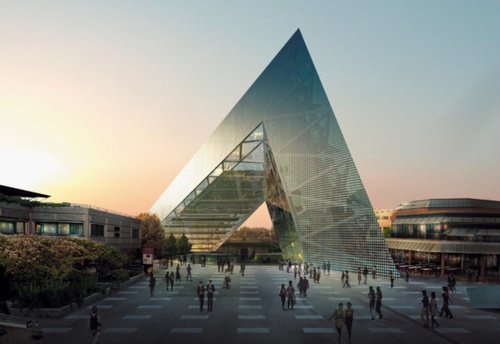
Now that Rem building bucku posted, on the other hand, is just trite.
The penthouse of that rem building will have 30'(!) ceilings.
Who cares how high the ceilings are when the building looks like such a first-year PoMo one-liner?
it's like my husband's buddy the hard-core hot rod racing dude - he gave us directions to his house for a party, and the last instruction is "...then turn left on Busy Bee Lane and go to the end..." Totally annihilates his tough-guy image.
Seriously, how embarrassing to say "That's where I live"!!
The H&dM is difficult to place, which I like - you can't describe it in one word. The Rem: trite.
haha
its actually a lot more interesting now I can see the lobby has sharted a bean.
NYC = YUPPIE SLUM
The question needs to be asked: who will buy these condos?
Seems like bad timing to announce these right after Lehman and Merril collapsed, and Goldman Sachs posted record losses. There goes their market.
Do you think these will actually get built?
Both of these projects are under construction.
56 Leonard on Dezeen
23 East 22nd on Dezeen
Dezeen > Curbed
Apurimac, this architecture thread is quite welcome. There hasn't been much worth reading in the discussion section lately. I've stuck to the news section. Both of these projects have been posted there a couple of times each.
i think its breathtaking...and i would kill to live there. if the price of entry was something more like one-human-head-and-a-pair-of-shoes-with-the-guts-of-a-1000-baby-turtles-on-it's-soles instead of $3 million then i'd be first in line.
i love the transparency of the units...it's the perfect match for my pants-less exhibitionist lifestyle...there is clearly something self-satisfying about the residents of tribecca having to look up to my genitals. maybe they could rename it tribepudgen for triangle below puddles' genitals
j-turn
these places will be snapped up by oversees buyers...Middle East and Asia
all the new shit in Downtown LA was bought up by the Koreans
i still like the idea of this stuff happening in the US-whatever the cost. You have to at least appreciate that much. The crap that is going up in the UAE is less appealing and less composed as these projects. I just wish the epidemic would spread to the south east.
unlike gehry's study models, for example, where only one out of the many gets chosen, not a variation is thrown out or a scrap wasted in this case.
hate. it.
this is not good, worthwhile architecture, just an unnecessary display of excess. i can't even find a way to be intelligently critical of it because it's just inefficient structure/irresponsible building envelope multiplied into the sky in a neighborhood for which it does not seem appropriate.
Steven: HdM or Rem, or both?
I see total structural inefficiencies in the Rem, but not the HdM, except for it being a bit show-offy tall and slender.
i don't have any inherent problems with structural inefficiencies...efficiency is often over-rated (isn't that what the engineers are always chasing?)
i was talking about the h&dm.
i don't have a comment about the oma project yet. i usually hate their projects at first until i realize the thinking behind them and then i usually end up being a fan, so...
enginners and developers chase efficiency.
my comments regarding market viability aside, I actually like both of them, although I do think they look undercooked in the images. But then again, these images are probably based on more schematic designs, and may not reflect the final design.
Re. the rem tower - this is a very "rem-y" response to the manhattan problem. I know he loves the whitney because it inverts the typical manhattan wedding cake. The manhattan skyscraper is all about staking and extrusion, so he bases his project on breaking that. It's a new section for the manhattan skyscraper.
The H and deM to me is about being granular. Rather that design the tower as a singular monolithic thing, this is about accumulating and staking blocks. It's like a glassier, taller Habitat 67. I also think that the experience in one of those cantilevered flats will be awesome. Think the koening case study house x 10000
It IS an Anish Kapoor sculpture! YIKES!
The renderings of the HdM tower are quite compelling as hey include belongings. It will look great inhabited. The Rem thing is a bit lifeless by comparison. The structural gymnastics for the sake of themselves are a bit tired. The cantilevered bays of the HdM building are like the terrace at Neutra's house in Silverlake. They are very good.
On another note, with the bottom dropping out of Wall Street, the timing of these projects is not good.
HA! Busy Bee ... "YOU FIND HER BUSY BEE!!"
http://www.youtube.com/watch?v=HYLTqJMxmTY
Maybe I just like the HdM because it looks like it's crumbling, sort of a Blade Runner thing. It looks unfinished, whereas the Rem looks completely closed. Too tight.
I'd say in general I don't mind things that are "too tall" being built in a mid-rise neighborhood. Everything is getting taller, after all, and probably should, and in the meantime the single tall thing makes possible the gasp as the height of it comes into view form a distance.
I'm trying to come up with a movie star the HdM looks like. The Rem looks like Carrot Top. Oh sorry, maybe I should post that on the Separated at Birth thread.
Hahaha that's great marimba but the scene makes me feel uncomfortable and did when I saw the movie too - you can see that the dog is ACTUALLY freaked out by all the yelling!
that dog just had a poor attitude, very negative.
liberty, i cant believe you're hating on rem. you know he's the man. but seriously, i like his building more than h&dem's. It, to me, shows that a single move/concept can be as striking as a hundred. The one move of trying to bend around one madison seems to give alot of really interesting situation. rather than balconies, some floor have glass floors.
the skin on rem's building is the structure. the reason for the varied floor heights and "random" looking windows is because the shear exterior relates to the loading of the wall. its actually quite interesting when it comes down to it.
seeing how the two buildings both give such a variation of floor plates throughout the building, i love that they both defy the typical, stack and stack and let the penthouse be the only unique plan logic.
cant wait to see the floor plan porn on curbed.
steven...
have to kind of disagree...the more i look at the hdem tower the more standardized it looks..the base and top are different of course..but the mid section is more or less a set of two floors copied..floors 7-25 are pretty standardized..then there are two sections of about seven floors each...
i do think i would like this building if it were shorter...i work in the building that you can see right behind the tower...a 16 story building..and you basically get 360 degree views as far as you want to see from the roof...views from 56 stories seems like overkill..a 32 story tower would've been overkill...but at least i'll get to watch construction for the next few months...that should be fun...i was wondering why they were driving piles all summer.
bucku, I do like some Rem. But I dislike, and always have, buildings that are intentionally trying to look "dangerous".
So this is funny: I was looking for an image of the Citicorp Tower, whose base I hate for exactly the reason of trying to look dangerous, and when I image googled it the FIRST image to come up was the one here, which is an image of it I once posted on Archinect.
Google you are my master (Rem is not).
the oma building in nyc is actually just phase one of another cctv style building...when adjacent property becomes available they will be another leaning tower to link up with it...phase three is digging a hole to china to connect with original cctv and create a conduit for world domination from the inside out. rem is your master.
At first glance, I was pretty excited by the H&deM tower just because the shear size and audacity of it. I wish they showed a little restraint; I like their proposal for the Roche tower in Basel much more, but this does seem more appropriate for the clutter of nyc. It's another step in H&deM's catalog of buildings that shift from the more sublime and subtle material investigations of their earlier work to the more formal and diagrammatic projects as of late...
I think it will be a really interesting building once it goes up; and much of its success will be based on how well the details turn out (which is where they usually don't disappoint). The small things like the concaved slab edges (look close at the renderings), the texture and color of the mullions, and the window joints will be what makes or breaks it. I'm just surprised they didn't show a rendering from ground level looking up to the top; it seems like that would be the most interesting (and everyday) view. Regardless, I'm sure once it is complete it will become a landmark, and second year architecture students from states over will be forced grudgingly sketch every floor for years to come.
his master plan is playing out. it seems that they should have a link to europe also at the base of this:
liberty, i get what you mean. i dont like it when a "feeling" or an aesthetic is forced either. i get the impression that the building here looks dangerous as a side affect to the initial conception. kind of like one of those circumstantial side effects i was describing earlier.
I absolutely LOVE the hyper-rationality of Rem's building. Notice how the apertures get smaller in the areas where the most structural stresses exist. Then as the building needs to get lighter near the top, the structure all but disappears. I find the simplicity of the idea very appealling and love the way the idea is inherently "worn on it's sleeve" or in this case, its skin.
The Hdm building is quite intriguing to me as well and will run counter to all of the flat facades in the area surrounding this structure. The scale of the base seems way off as does the absence of a "top" which inherently runs counter to the basic principles of what a "tower" is supposed to be. In many ways, as they have challenged the notion of what "skin" is throughout the years, perhaps there is a "skin trick" up their sleeve with this one that is not well represented in the rendering at this point. But the building could evolve into a contemporary version of Safdie's Habitat near the top... which could be nice... I don't see what there is to hate about this one either? The "crumbling effect" is what helps break up the massiveness of the structure and as someone else mentioned, the middle floors appear very consistent and repetitive which would save on costs...
I might feel dizzle on the top floor of H&DM's building, too much transparent and cantilevering is psychologically scaring...at least for the people who are fear of height....like me
rem's amazing part is always his shining thoughts on program instead of the technology....as he said, arup never say no.....and this propose defin reminds of his failed proposal to Whitney Museum Extention....funcky and amazing...
More than anything, I'm glad to see that experimentation has returned to the New York skyscraper.
Is this HdM's idea of the old NY - Chicago rivalry; stomping on the bean?
I'd be amused if that was the intention
curt clay, I love that "hyperrational" thing too, usually. And I like that aspect of it in this building. I liked it even better in Holl's Simmons Hall, where the color of the deep window recesses relate to their structural relationship to the whole. But Simmons Hall is a deceptive building, it looks so bizarre, I look at it and go "What the hell is that?". This Rem building is so up-front about hanging over another air space, it's too obvious: simplistic vs. simple. And the subtle interest of the changing window sizes is lost because of the "in your faceness" of the reverse stepping.
The HdM has, for me, that similar "What the hell is that?" aspect that I like very much. Ed Ruscha said that bad arts makes you go: "Wow! Huh?" but good art makes you go "Huh? WOW!" The Rem, to me, relies on the wow but doesn't offer much more than that.
I eman, I'm not saying rem's is the worst building to come down the pike (though another one of his might be....) and HdM's is the best (though again....), but I think the HdM offers more long-term interest than Rem's, and I would say this is typically true of both their bodies of work.
OMA, Idea Vertical Campus, Tokyo, Japan, 2004
as much as i love to hate koolhaas, i suspect his condo's gonna be better than H&dM's. if you look at 40 bond...it's got a pretty facade...but it's all money, and very little design.
i'm also perversely attracted to rem's tongue in cheek approach to NYC's shitty setback laws. some irony there. oh wait...wasn't irony the domain of 80's PoMo?
and talking about trusting opinion...
mirror, mirror on the wall
Shitty setback laws? You mean what allows sunlight to penetrate to the street? How terrible that pedestrians in NYC should be entitled to that vital of life elements.
Block this user
Are you sure you want to block this user and hide all related comments throughout the site?
Archinect
This is your first comment on Archinect. Your comment will be visible once approved.