from an email i received by some academic types...
Thought you guys would get a laugh out of this. This is a student's
response to my asking him to change his font to Times New Roman on a paper.
>
Stephanie,
I apologize for using the incorrect font in my opinion paper. You
are correct that the prompt specified Times New Roman, a point I
overlooked in constructing my paper. My paper instead was in the Swiss-born font Helvetica. Helvetica is the default font for *Pages*, which is the word processor I use. I find that its clear, open style makes type easier on the eyes, and, as you can see from the attached document, adds no length to a paper over Times New Roman. Another element of this font that I found
appealing, especially in the case of this assignment, is that it
takes with it none of the racially-charged biases that Times New Roman does. The British Empire, which had a long history of oppression over almost all of the groups we have discussed in core, used serif fonts to make type less readable to lower classes. In 1937, the remnants of this pretentious exclusivity resulted in the establishment of the Times Roman font, which was
quickly accepted as a standard. In contrast, the Swiss, who have a
long history of neutrality, developed the much more readable Helvetica font, whose sans-serif design exudes a kind of non-pretentious simplicity, making it more readable, and symbolizing a movement away from social hierarchy-through-typeface, and toward a content-based value system. As we
evolve to have a more equal society, fonts like *Helvetica *are
gaining recognition. The noble country of Canada, which many consider a paradigm of healthcare and social justice, proudly boasts *Helvetica* as its national
font. As for readability, even the United States government
acknowledges that *Times New Roman* tragically lacks. Instead of joining the movement of equality started by the Swiss and perpetuated by countries like Canada, the
US government simply requires that all diplomatic documents be
printed in size 14 *Times New Roman*, as opposed to the mere 12 required by a more readable font such as *Helvetica*. Alas, it will take time for our own country to shed its prejudiced legacy and move toward the sans-serif elegance of *Helvetica*, but until then, I like to think that our contribution to social progression can come in the form of small acts of
defiance, such as choosing to write our essays in equality-conscious fonts.
Thank you for your consideration, and I hope you have a nice
weekend.
>
> Sincerely,
>
>XXX
for my own classes, I dictate word counts as opposed to pages to lessen this problem or reliance on particular fonts. Rarely have I had someone submit something in a font too radical with regards to legibility -- usually its Times, Arial, Helvetica, whatever.
I do like his spirited argument,
and hope you agreed to accept the paper.
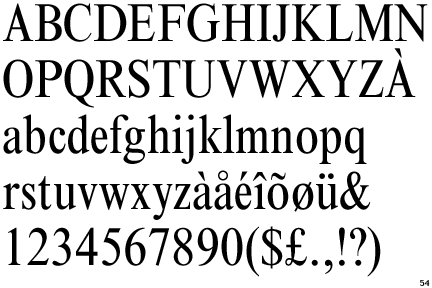
Well, is this the first time that serifs have been equated with (intentional) illegibility ? News to me -- but I haven't seen a copy of ampersand ("&") in a while. . .
The English invented serifs to take up space. That way serifs would require more space for type and use more pages therefore killing more trees. The English did this to waste trees over hundreds of years just because they hate the lower class who couldn't afford fiberglass-handled hammers. Over time the wood-handled hammers also climbed up to an inaccessible price. Now the lower class can't build.
The English hate trees. And they hate the lower class. And I am an idiot.
Sincerely,
XXX
P.S. Serifs take up more ink, which causes cancer to those who produce it. Ink is made by the lower class.
Anybody remember the days when Helvetica Medium was the display font of choice, in certain quarters ? It was only 40 years ago. . .when 'font' still had its original definition !
Ah, feels like college all over again. I heard in Japan, college students were supposed to lean that way, and by the time they were elderly, they were to be very conservative. It was all a part of the process.
Also, I thought during the earlier printing press days, serifs helped strengthen the metal type. And, architecturally, when carved in stone, the serifs were used to clean up the end strokes.
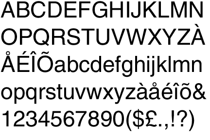
Graphically, Helvetica feels way-cool-modern, but faster to read at that point size?
This guy is gold! Yes--the Swiss are the most equality-concious earth-citizens I know, wouldn't you guys agree?
Tell him that the Swiss have a long tradition of respecting authority and diligently learning from their teachers. Who else could make the watches of the world? I hope the Swiss one day save us from those nasty high-minded Brits, with their oppressive national health care system and foreign aid to developing countries.
"In Italy, for thirty years under the Borgias, they had warfare, terror, murder, bloodshed — they produced Michelangelo, Leonardo da Vinci and the Renaissance. In Switzerland, they had brotherly love, they had five hundred years of democracy and peace, and what did that produce? The cuckoo clock."
Dear, dear. Has Swiss graphic design been so completely eclipsed -- while early modernism continues to inform architecture and other design disciplines, with (some might say) renewed enthusiasm ?
"Swiss graphic design and “the Swiss Style” are crucial elements in the history of modernism. During the 1920s and ’30s, skills traditionally associated with Swiss industry, particularly pharmaceuticals and mechanical engineering, were matched by those of the country’s graphic designers, who produced their advertising and technical literature. These pioneering graphic artists saw design as part of industrial production and searched for anonymous, objective visual communication. They chose photographic images rather than illustration, and typefaces that were industrial-looking rather than those designed for books."
The crisp black and white of the page we're looking at, with asymmetrical layout, ample white space, and sparing but persistent appearance of red ink as an accent, recalls nothing else but classic Swiss practice. . .doesn't it ?
Not to belabor the point (heh heh -- anybody still here ?) but of course black and red on white predates the printing press, and is seen in many forms including those juicy letterpress volumes of a certain age where a good cross-light reveals deep impressions filled with black and red ink, in a (sometimes) yellowing field of textured rag or wood-fiber paper (depending on cover price). . .
Viking Range Corporation has been named by Fortune magazine as one of the “10 Breakaway Brands” of 2006 in its September 18th edition. For this annual report, Fortune turned to . . .
not the same thing, quite... from my Designer's Lexicon
typeface: The term (based on "face"--- the printing surface of a metal type character) describing a type design of any size, including weight variations on that design such as light and bold, but excluding all other related designs such as italic and condensed. As distinct from a "type family," which includes all related designs, and a "font," which is one design of a single size, weight, and style. Thus Baskerville is a type family, wheras Baskerville Bold is a typeface and 9pt Baskerville Bold Italic is a font.
Yes. My point is that I believe 'font' is being used more now when 'typeface' is what is meant. Am I wrong in this ? (Of course, with the advent of do-it-yourself typography we are no longer dealing with professional graphic designers in many cases. I may have too few of those among my friends, and too many of the others. . .!)
Misuse of the term by the masses doesn't make it right or mean that one term is replacing the other: it is what it is, misuse. And I would even say that when most people say "font" they really don't even mean "typeface" but "type family" because they don't consider the associated faces to be any different, but part of the same bundle.
No doubt. Type is a commodity that is also an art form -- like building, I suppose. My interest was spurred by the "lettering" classes we had as freshmen at RISD. Once the (home-made reed) pen is in hand, one learns something about the making of letterforms, and the inevitable history thereof. The school library had a copy of the impressive "OZbook" of Oswald Cooper, among other treasures, as I recall. Many who were not destined to become graphic designers nevertheless joined a community who knew something at least of these pleasures and disciplines. (The school library had a copy of the impressive "OZbook" of Oswald Cooper that I pored over and coveted.)
Thanks for posting that definition.
Feb 17, 08 3:45 pm ·
·
Block this user
Are you sure you want to block this user and hide all related comments throughout the site?
Archinect
This is your first comment on Archinect. Your comment will be visible once approved.

Colonial Fonts...
from an email i received by some academic types...
Thought you guys would get a laugh out of this. This is a student's
response to my asking him to change his font to Times New Roman on a paper.
>
Stephanie,
I apologize for using the incorrect font in my opinion paper. You
are correct that the prompt specified Times New Roman, a point I
overlooked in constructing my paper. My paper instead was in the Swiss-born font Helvetica. Helvetica is the default font for *Pages*, which is the word processor I use. I find that its clear, open style makes type easier on the eyes, and, as you can see from the attached document, adds no length to a paper over Times New Roman. Another element of this font that I found
appealing, especially in the case of this assignment, is that it
takes with it none of the racially-charged biases that Times New Roman does. The British Empire, which had a long history of oppression over almost all of the groups we have discussed in core, used serif fonts to make type less readable to lower classes. In 1937, the remnants of this pretentious exclusivity resulted in the establishment of the Times Roman font, which was
quickly accepted as a standard. In contrast, the Swiss, who have a
long history of neutrality, developed the much more readable Helvetica font, whose sans-serif design exudes a kind of non-pretentious simplicity, making it more readable, and symbolizing a movement away from social hierarchy-through-typeface, and toward a content-based value system. As we
evolve to have a more equal society, fonts like *Helvetica *are
gaining recognition. The noble country of Canada, which many consider a paradigm of healthcare and social justice, proudly boasts *Helvetica* as its national
font. As for readability, even the United States government
acknowledges that *Times New Roman* tragically lacks. Instead of joining the movement of equality started by the Swiss and perpetuated by countries like Canada, the
US government simply requires that all diplomatic documents be
printed in size 14 *Times New Roman*, as opposed to the mere 12 required by a more readable font such as *Helvetica*. Alas, it will take time for our own country to shed its prejudiced legacy and move toward the sans-serif elegance of *Helvetica*, but until then, I like to think that our contribution to social progression can come in the form of small acts of
defiance, such as choosing to write our essays in equality-conscious fonts.
Thank you for your consideration, and I hope you have a nice
weekend.
>
> Sincerely,
>
>XXX
is this for real?
come on! it's a freakin' font!!!
and i thought serifs made type easier to read.
that's great.
for my own classes, I dictate word counts as opposed to pages to lessen this problem or reliance on particular fonts. Rarely have I had someone submit something in a font too radical with regards to legibility -- usually its Times, Arial, Helvetica, whatever.
I do like his spirited argument,
and hope you agreed to accept the paper.
I would love to have seen the professors face as he/she read the response,
Wow, I like fonts, but what a fool.
I like how Switzerland's neutrality makes Switzerland equal and not racist. What???
Well, is this the first time that serifs have been equated with (intentional) illegibility ? News to me -- but I haven't seen a copy of ampersand ("&") in a while. . .
the swiss are some of the worst racists I've met. neutrality didn't stop them from helping the nazis
treekiller,
The English invented serifs to take up space. That way serifs would require more space for type and use more pages therefore killing more trees. The English did this to waste trees over hundreds of years just because they hate the lower class who couldn't afford fiberglass-handled hammers. Over time the wood-handled hammers also climbed up to an inaccessible price. Now the lower class can't build.
The English hate trees. And they hate the lower class. And I am an idiot.
Sincerely,
XXX
P.S. Serifs take up more ink, which causes cancer to those who produce it. Ink is made by the lower class.
Thanks ! I just needed some extra material, to finish my Racial Supremacy 201 paper. . .
use condensed times new roman to offset the waste.
what's so special?
Anybody remember the days when Helvetica Medium was the display font of choice, in certain quarters ? It was only 40 years ago. . .when 'font' still had its original definition !
Ah, feels like college all over again. I heard in Japan, college students were supposed to lean that way, and by the time they were elderly, they were to be very conservative. It was all a part of the process.
Also, I thought during the earlier printing press days, serifs helped strengthen the metal type. And, architecturally, when carved in stone, the serifs were used to clean up the end strokes.
Graphically, Helvetica feels way-cool-modern, but faster to read at that point size?
i had not realized there was such a thing as a national font. i wonder what norway's is? google time...
hmm...doesn't seem to be an "official norwegian" fonts but they have good variety on this page...i need to think about a favourite now...
Americans can't even use their own national font.
whats ironic is that helvetica is the name the romans used for switzerland!
vado, the Romans used serifs to create more work for the guy chiseling the stone - that is the lower class. The Romans hate the lower class.
Sincerely,
XXX
not to mention all those x's and v's and iii's. kill the brick roman.
kill the brick...my goodness I love archinect!
HA HA HA HA HA AH AHHAHAHAHAHAAHAHA
This guy is gold! Yes--the Swiss are the most equality-concious earth-citizens I know, wouldn't you guys agree?
Tell him that the Swiss have a long tradition of respecting authority and diligently learning from their teachers. Who else could make the watches of the world? I hope the Swiss one day save us from those nasty high-minded Brits, with their oppressive national health care system and foreign aid to developing countries.
From Helvetica, per SDR's link :
It should be neutral. It shouldn’t have a meaning in itself.
Words of wisdom from Harry Lime...
"In Italy, for thirty years under the Borgias, they had warfare, terror, murder, bloodshed — they produced Michelangelo, Leonardo da Vinci and the Renaissance. In Switzerland, they had brotherly love, they had five hundred years of democracy and peace, and what did that produce? The cuckoo clock."
Dear, dear. Has Swiss graphic design been so completely eclipsed -- while early modernism continues to inform architecture and other design disciplines, with (some might say) renewed enthusiasm ?
Or is this a local backlash ?
From a Yale Press blurb, found online:
"Swiss graphic design and “the Swiss Style” are crucial elements in the history of modernism. During the 1920s and ’30s, skills traditionally associated with Swiss industry, particularly pharmaceuticals and mechanical engineering, were matched by those of the country’s graphic designers, who produced their advertising and technical literature. These pioneering graphic artists saw design as part of industrial production and searched for anonymous, objective visual communication. They chose photographic images rather than illustration, and typefaces that were industrial-looking rather than those designed for books."
The crisp black and white of the page we're looking at, with asymmetrical layout, ample white space, and sparing but persistent appearance of red ink as an accent, recalls nothing else but classic Swiss practice. . .doesn't it ?
Not to belabor the point (heh heh -- anybody still here ?) but of course black and red on white predates the printing press, and is seen in many forms including those juicy letterpress volumes of a certain age where a good cross-light reveals deep impressions filled with black and red ink, in a (sometimes) yellowing field of textured rag or wood-fiber paper (depending on cover price). . .
say no to trajan @ the movies!
Ha !
Now, let's have one for the reversed symmetrical Roman capitals creeping into even professional typography. . .
Viking Range Corporation has been named by Fortune magazine as one of the “10 Breakaway Brands” of 2006 in its September 18th edition. For this annual report, Fortune turned to . . .
helvetica- great film, corporate font

my favourite, naturally celtic
The X in that "hand" will explain why the V in Viking is incorrect. Once you've lettered with a pen or brush, you know.
The F, G and T in that Celtic face would read only in context, perhaps. The G is meaningless and ugly (to me), the T beautiful.
Cool. Is there something in the content that we should know about. . .?
possibly just that Jan Tschichold is the most influential figure in the modern use of typography. Prior to Tschichold, it was all about the symmetry.
Ah -- so he's the one. I wonder what the dates of those publications are.
I note also the black and red, and his use of contrasting faces (now called fonts) on those covers.
In reading popular fiction, I have enjoyed the endless examples of asymmetric page layout and font choice to be found on chapter-head pages.
Thanks for the examples, and the information.
not the same thing, quite... from my Designer's Lexicon
typeface: The term (based on "face"--- the printing surface of a metal type character) describing a type design of any size, including weight variations on that design such as light and bold, but excluding all other related designs such as italic and condensed. As distinct from a "type family," which includes all related designs, and a "font," which is one design of a single size, weight, and style. Thus Baskerville is a type family, wheras Baskerville Bold is a typeface and 9pt Baskerville Bold Italic is a font.
Yes. My point is that I believe 'font' is being used more now when 'typeface' is what is meant. Am I wrong in this ? (Of course, with the advent of do-it-yourself typography we are no longer dealing with professional graphic designers in many cases. I may have too few of those among my friends, and too many of the others. . .!)
Misuse of the term by the masses doesn't make it right or mean that one term is replacing the other: it is what it is, misuse. And I would even say that when most people say "font" they really don't even mean "typeface" but "type family" because they don't consider the associated faces to be any different, but part of the same bundle.
No doubt. Type is a commodity that is also an art form -- like building, I suppose. My interest was spurred by the "lettering" classes we had as freshmen at RISD. Once the (home-made reed) pen is in hand, one learns something about the making of letterforms, and the inevitable history thereof. The school library had a copy of the impressive "OZbook" of Oswald Cooper, among other treasures, as I recall. Many who were not destined to become graphic designers nevertheless joined a community who knew something at least of these pleasures and disciplines. (The school library had a copy of the impressive "OZbook" of Oswald Cooper that I pored over and coveted.)
Thanks for posting that definition.
Block this user
Are you sure you want to block this user and hide all related comments throughout the site?
Archinect
This is your first comment on Archinect. Your comment will be visible once approved.