blanket: i don't know that the handrails just haven't been the focus of much attention yet. they don't kill it for me. but the roof perspective! boring, undifferentiated ramping? it's be like a frying pan up there.
book hill: the renderings look nice, but there's nothing about it overall that especially excites me. this leaves me as cold as blanket.
cut: i love this one as an expression, but the undercutting/underpinning of the existing annexes really doesn't appear to be thought out. hard to get a handle on the whole facility in what's given here, except for the few things they really want you to see. seems to want to be simple, but i don't believe it. would probably look much more complicated.
dikthornan is impressive. hard to get a handle on it without staring for a while, but pretty sophisticated. probably too massive, even though it's trying to be a backdrop.
nosce te ipsum is simple and beautiful and somehow both very special and deferential. there are some subtleties here that make a good design into magic. this one gets my vote.
i like everything about delphinium up until those ridiculous elevations. the plan seems smart and reasonable; the section reserved, but spatially interesting (i particularly like the scale and proportions to the street). but please, for goodness sake, take the time to develop the elevations and not just slap a graphic onto them.
i also like book hill. it also has a nice scale to it and is conceptually compelling.
i love the section through cut (the cut through section), but generally find the project ugly.
and steven's spot on with blanket. the roof looks like an absolutely miserable space.
Nosce: relooked at it after ur comment...
vray renders are impressive with this sad mood etc... but i think the choice of keeping the annexes was a wrong one... we'll see what the town says about it ;)... the tower is not convincing either :)
They all look pretty lame to me. Cut has the potential to be nice, but whoever is doing the design has horrible presentation skills and it kills it for me. Otherwise, they are all pretty boring.
after being a critic at a local university project for cranbrook's museum addition (provocation as conservation) and looking at coophimmelblau's akron museum addition, i wish these were BRAVER; if you are going to DO IT, then DO IT! there is no engagement, very little interaction, no intervention...having said that, and if respect is the key, nosce te ipsum seems to be the one that engages the urban texture...but as steven ward said:"there are some subtleties here that make a good design into magic", and i am not surely convinced the magic is there...
thanks for posting the wepage again...it's nice to have an update...i love how fully exposed this competition process has been so far...if you guys find some time, try tracing back the jury comments from stage 1 at each entry;
i think the real match is between book hill and nosce te ipsum and it all depends on how brave Stockholm will be. nosce te ipsum has gained a lot since the first phase. it's now a project that really fits in and creates a covered urban space beneath the annexes. blanket, delphinium and most of all cut has lost a lot of quality. cut is too dark and too many pilars! What seemed to be transparent is now too opaque.
i love dikthörnan in plan, it's artificial angle of observatory hill is genious. unfortunately it seems quite dark and i don't like the renders.
book hill is still my favourite. and it's presentation fantastically legible. i just hope the roofpath really will be used, it leads to what?
1 book hill 2 nosce te ipsum 3 dikthörnan 4 blanket 5 delphinium 6 cut
roopath leads to the observatory hill, one of the goals of the competition was to link that famous stockholm hill to the library, shall it be visually or physically... another goal was to decide to keep or not the annexes...this is where the whole decision will be hard to take... conservative stockholm is going to prefer annexes alive, and modernists will destroy those not so important architecturally pieces... problem is asplund has the same image in sweden as FLW in the US, or le Corbusier in France: untouchable.... all the projects that connected to the library where rejected.... which leads to a strange competition: the program to make an extension that is not connected physically to original buyilding....
nils, i'm from sweden and i participated in the competition...i know... what i wanted to say is that the the roofpath is leading to the observatory hill but i don't think this is a that attractive destination and therefore i'm doubtful this path will be that populated. unless stockholm doesn't build a new university building on the top (just as asplund had planned...)
i think nosce te ipsum wins even though i hope for book hill. really.
calle, i've been there too ;) i know the top is not that of a fancy walk... and maybe not that a goal... and i chose in my project not to connect to it physically because of that reason...
You are right that there is doubt that population would ever colonize the roof... its a longer way to the top too...
This said and rethinking the fact that the annexes are sacred land, Nosce has chances... but i find the inside pretty dull and mosoleum like... a mix of brutalism and 70's city halls ( boston..)... I like however the connection to asplund which could work ok...
the tower is scary and the angle of the project there is not solving problems... last but not least: the entrance is not that of a world class project...too little ambition there..but the low profile svensk officials will maybe prefer that :)
Simples (or anyone who may know): were images of the cranbrook competition ever posted on the interent? I was looking for results a few months ago, but couldn't find any. was interested in the brief and really wanted to see the results.
I'm quite surprised at the good reviews for "Nosce..." - even in the first round, it seemed like a joke. The interior is more Kafkaesque than anything (also, the running black shadows - the library-goers, I guess - make one think of a soundtrack featuring machine-gun fire) and the perspective views from the outside show a building with totalitarian yearnings without a straightbacked fascist rigor.
Also, the new "main" entrance from the street, jutting out agressively like a little pecker, does not work visually in the streetscape, functionally with the flows it should accomodate or symbolically by actually signalling the importance and use of the spaces inside.
---
Of the other proposals: the designers behing Cut and Delphinium don't seem to have developed their proposals - especially cut looks like a concept that could not be translated into a building in the end. Shame.
Dikthörnan does not have the clarity it first implied - now the building scales the hill in an awkward "addition's addition" in the back and the interiors don't seem resolved - or very flexible. And why should one practically cut out natural light? The roof-portholes don't help.
Book-hill looks like a diagram, and the presentation is sure to capitalize on this - the designers have obviously had a diarrhea of diagrams - on less telling than the other. But the design is clear and the roof is beautifull - eventhough I don't doubt that the hilltop is not that great at present, the ambition to develop the connection is healthy and public-minded.
---
It's going to be interesting to see what happens, and I personally put my money on Bookhill.
i thought it was cool that there was a mcdonalds at that library. i didn't realize that it was designed by some famous architect...guess i'm more interested in happy meals
ross...not to take this discussion into a cranbrook tangent, see the discussion here.. http://www.archinect.com/forum/threads.php?id=51188_0_42_0_C
towards the end, there is a link to picassaweb with some images...unfortunately, that's the only thing i have seen...(though i haven't looked into it much)...feel free to bring that thread back up...i was trying to keep it going, but w/ not much success...hope it helps...
I was already disappointed with the proposals chosen for the second round - either too bland or too expressive and obsessed with "intervening" with the hill! I always thought the monumental and isolated form of the library needed to be balanced with an extension that was similar in scale but with a strong character of its own.
i can't access the site now to remind myself what delphinium was but i do think it's strange that most of us in this discussion didn't think very highly of it. jafidler gave it the best review, but even his had a disclaimer. i apparently didn't even notice it enough to comment. calleklen gave named it 5th choice of 6...
it's frustating that we can't access the site anymore to see the proposals again. is there a new site up?
i remember liking delphinium because it had a simple concept and a throughful massing (good relationship to the street, hill, and library), but it needed some serious development (or was just going for dutch casual). i'd love to see the final design...
i do have a feeling it won because it was one of the two proposals that took the most conservative stance towards the original library, basically trying to distance the massing as far away from the asplund as possible. definitely a safe approach.
delphinium is one of two proposals that were selected for the second phase that actually is a mere building (the other one is nosce te ipsum), and both of these have placed the building as far away from asplund as possible. All other projects dig in to the hill or are an extension of the hill. I guess this fact tells quite much about how complete asplund's building is and how difficult it is to include it in a bigger complex. Maybe it's just not a good idea to extend the existing library...
i like the idea of a garden/park between asplund's building and the new one and the semitransparant facades (hiding a simple concrete block). it's scale is though too big and it divides asplund's building from the rest of the city.
the site is working for me (arkitekt.se/asplund) where you also can see honorary mentions. otherwise check dn.se or svd.se.
omg what a poor poor result...lacks masterization big time...
the poor circles ( the circle like chimney at the back of the long building is incredibly weak.. looks like a 1985 atrium in a poor's man office building. The facade along the sloped street is a nonsense.. people will have to entrance facing the big building in the small street... its crazy!
The thing that was ok ( the main building position on the side of the site, hidding the hideous offices is ruined by the platform in the middle with that circle... what a poor relation in the back of the asplund.. this staircase and the wall creates a corridor that is really weak...damn there was much better entries left... not sure why they did not give 2d price too...
weak project for a weak jury... simple as that.....
i don't know if it lacks masterization. i don't know what that means...?
heike also did phd in my profs lab, but nearly 10 years ago, so i am kinda proud to see her succeed even though i don't know her.
it is alright as a design. very japanese in many ways. also quite conservative, and i think that is why it was selected in the end. that it doesn't try to compette with asplund is for me a good approach. I think it will be nice. not great, seductive orgasm inducing architecture, but quite nice. nothing wrong with that.
if we step back from the competition and all of its crazy entries and just consider it on its own merits, i think this winner will certainly be an exciting project, even moreso as ms hanada gears up to make it real.
some of us may just be disappointed because so many of the others were amazing fantasies that would have tested things that a lot of us think about. but given the current culture of BUILT architecture this certainly isn't conservative!
note that a lot of the negative comments reflect the disappointment that 'it looks like a building'!!
Isn't it a rarity to see the same format (identical bird's-eye view) for all the presentations ?
..................................................................................................
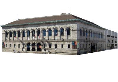
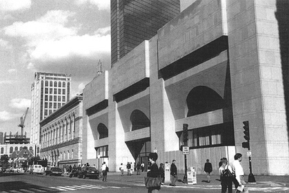
Adjoining an icon calls for a certain modesty, don't you think ? I wish Philip Johnson had thought so, when he added to McKim, Mead and you-know-who's Boston Public Library.
Is this PJ (c 1972) doing Louis Kahn ? At least he provided a healthy reveal. Using the identical material (a local granite) and matching (roughly) the cornice line isn't always enough, is it. . .
what is really cool is this looks to be heike's first project that isn't an installation or a small house. howzat for a break, eh?
only in europe can a major project go to a young architect (my age or younger i think, which is to say under 40) with not so much experience. In the usa or canada this would never ever happen.
whatever the building looks like i think the whole system is a winner just to start with.
quickly looking, i like the winning project among the others. i would give open public access to the hill from the street. they have created a nice park that should not be exclusively for library visitors.
probably that will be requested by the public during the design development. it has little to do with library already being a public building. it has to do with direct access and not being limited to library hours etc.
i would like to know why they didn't do that already.
Orhan, I'm shocked (re the BPL). But perhaps you jest ?
Thinking about what I would propose instead of PJ's refined brutalism (if that isn't an ox-Y-moron) how about taking the copper cornice as a cue and clad a box with it, punctured (like Holl's dormitory across the Charles) with a grid of tiny square windows. . .
Maybe an umrella that leaks (otherwise it's not art...)
-delphinium is something of a surprise winner because the lack of refinement in the plans & generally the reworking for 2ns stage (I'm always sceptical of big geometric shapes as the arcs in the plans as "architecture") - but otherwise, it looks ok. solid. and of course, some of the other, more egyptian or more kafkaesque or just more dutch/dansih of the proposals could have attained levels of catastrophe this design can never even start to reach. which is good.
indeed its a soft belly answer...but still better than a totally wrong one...
The circles is what makes me think its weak...the small one is just...bad lol
Aka Compass architecture....
As Henri Ciriani says ( corbu fan): its not a "courbe" ( curve) its a courbette (aka: small curve but also a bow to a superior)
i still like the understated aspect of it. it's a box, but clearly has some sectional play going on within the box.
her initial decisions are very clear and she protected them throughout her process: provide a backdrop to the asplund; don't put a building right next to the asplund. the podium between them might work well as a sort of promenade (will have to wait for further development) and the access to the hill is made more desirable - selling it as a potentially viable park setting for me.
there is a lot for ms hanada to do, but i'm buying it. i think some of the clunky geometry that's bugging you, nils, may be worked out as things become more real. the exigencies of construction, cost, and programmatic considerations usually make projects better because these things take priority over geometry. she'll do some editing but, as long as she holds on to the original premise, this has the potential to be a great project.
Steven: I agree much can still be gained...aka high potential... but since its stage 2 i think she could have already made her intentions clearer at this stage. I'm was just teasing because free geometries always make me cry....
I agree her positionning of the main building as far as possible from asplund's 'dont touch me' building is smart now with the feedback of the untouchable icon decision... damn i should have thought of it too lol...
My project name was even Iconoclash to tell you how crazy i was ;) from what i saw... we were one of the few projects daring to tear appart asplund's back facade ( the late built, logistics wing with no interest) to connect an extension....bad move thu :)
chipperfield's is a beautiful object, and deferential as well, but i don't understand what would really happen in front of it (nor, it appears, does chipperfield) and the hill isn't treated very nicely at all. not a very convincing urban solution.
In my opinion The Book Hill should have won... or even cut or dikthörnan. But to see the Delphinium as the winner of a loooong process and many hours put forth by the participants is very disappointing....

Asplund - Stockholm library competition stage 2 results
book hill is masterized and will win
the angle one: diktornan: 2d better choice for me...
the others are not that good... blanket ruins it with the last perspectives and the handrails... interior looks like inside a pyramid :)...
what's u're comments?
Nils
Architect in Lyon, France
blanket: i don't know that the handrails just haven't been the focus of much attention yet. they don't kill it for me. but the roof perspective! boring, undifferentiated ramping? it's be like a frying pan up there.
book hill: the renderings look nice, but there's nothing about it overall that especially excites me. this leaves me as cold as blanket.
cut: i love this one as an expression, but the undercutting/underpinning of the existing annexes really doesn't appear to be thought out. hard to get a handle on the whole facility in what's given here, except for the few things they really want you to see. seems to want to be simple, but i don't believe it. would probably look much more complicated.
dikthornan is impressive. hard to get a handle on it without staring for a while, but pretty sophisticated. probably too massive, even though it's trying to be a backdrop.
nosce te ipsum is simple and beautiful and somehow both very special and deferential. there are some subtleties here that make a good design into magic. this one gets my vote.
don't forget that it's in sweden steven so i'm not sure the roof as frying pan critique is apt
i like everything about delphinium up until those ridiculous elevations. the plan seems smart and reasonable; the section reserved, but spatially interesting (i particularly like the scale and proportions to the street). but please, for goodness sake, take the time to develop the elevations and not just slap a graphic onto them.
i also like book hill. it also has a nice scale to it and is conceptually compelling.
i love the section through cut (the cut through section), but generally find the project ugly.
and steven's spot on with blanket. the roof looks like an absolutely miserable space.
Nosce: relooked at it after ur comment...
vray renders are impressive with this sad mood etc... but i think the choice of keeping the annexes was a wrong one... we'll see what the town says about it ;)... the tower is not convincing either :)
puddles> indeed not a frying pan but a nice slippery place for winter slides ;)
They all look pretty lame to me. Cut has the potential to be nice, but whoever is doing the design has horrible presentation skills and it kills it for me. Otherwise, they are all pretty boring.
after being a critic at a local university project for cranbrook's museum addition (provocation as conservation) and looking at coophimmelblau's akron museum addition, i wish these were BRAVER; if you are going to DO IT, then DO IT! there is no engagement, very little interaction, no intervention...having said that, and if respect is the key, nosce te ipsum seems to be the one that engages the urban texture...but as steven ward said:"there are some subtleties here that make a good design into magic", and i am not surely convinced the magic is there...
thanks for posting the wepage again...it's nice to have an update...i love how fully exposed this competition process has been so far...if you guys find some time, try tracing back the jury comments from stage 1 at each entry;
i love asplund's library, but a bit of bravery, perhaps?

i never understand the "abs" pics appear at the top of this page?
i think the real match is between book hill and nosce te ipsum and it all depends on how brave Stockholm will be. nosce te ipsum has gained a lot since the first phase. it's now a project that really fits in and creates a covered urban space beneath the annexes. blanket, delphinium and most of all cut has lost a lot of quality. cut is too dark and too many pilars! What seemed to be transparent is now too opaque.
i love dikthörnan in plan, it's artificial angle of observatory hill is genious. unfortunately it seems quite dark and i don't like the renders.
book hill is still my favourite. and it's presentation fantastically legible. i just hope the roofpath really will be used, it leads to what?
1 book hill 2 nosce te ipsum 3 dikthörnan 4 blanket 5 delphinium 6 cut
roopath leads to the observatory hill, one of the goals of the competition was to link that famous stockholm hill to the library, shall it be visually or physically... another goal was to decide to keep or not the annexes...this is where the whole decision will be hard to take... conservative stockholm is going to prefer annexes alive, and modernists will destroy those not so important architecturally pieces... problem is asplund has the same image in sweden as FLW in the US, or le Corbusier in France: untouchable.... all the projects that connected to the library where rejected.... which leads to a strange competition: the program to make an extension that is not connected physically to original buyilding....
Nils
nils, i'm from sweden and i participated in the competition...i know... what i wanted to say is that the the roofpath is leading to the observatory hill but i don't think this is a that attractive destination and therefore i'm doubtful this path will be that populated. unless stockholm doesn't build a new university building on the top (just as asplund had planned...)
i think nosce te ipsum wins even though i hope for book hill. really.
calle, i've been there too ;) i know the top is not that of a fancy walk... and maybe not that a goal... and i chose in my project not to connect to it physically because of that reason...
You are right that there is doubt that population would ever colonize the roof... its a longer way to the top too...
This said and rethinking the fact that the annexes are sacred land, Nosce has chances... but i find the inside pretty dull and mosoleum like... a mix of brutalism and 70's city halls ( boston..)... I like however the connection to asplund which could work ok...
the tower is scary and the angle of the project there is not solving problems... last but not least: the entrance is not that of a world class project...too little ambition there..but the low profile svensk officials will maybe prefer that :)
Nils
Simples (or anyone who may know): were images of the cranbrook competition ever posted on the interent? I was looking for results a few months ago, but couldn't find any. was interested in the brief and really wanted to see the results.
I'm quite surprised at the good reviews for "Nosce..." - even in the first round, it seemed like a joke. The interior is more Kafkaesque than anything (also, the running black shadows - the library-goers, I guess - make one think of a soundtrack featuring machine-gun fire) and the perspective views from the outside show a building with totalitarian yearnings without a straightbacked fascist rigor.
Also, the new "main" entrance from the street, jutting out agressively like a little pecker, does not work visually in the streetscape, functionally with the flows it should accomodate or symbolically by actually signalling the importance and use of the spaces inside.
---
Of the other proposals: the designers behing Cut and Delphinium don't seem to have developed their proposals - especially cut looks like a concept that could not be translated into a building in the end. Shame.
Dikthörnan does not have the clarity it first implied - now the building scales the hill in an awkward "addition's addition" in the back and the interiors don't seem resolved - or very flexible. And why should one practically cut out natural light? The roof-portholes don't help.
Book-hill looks like a diagram, and the presentation is sure to capitalize on this - the designers have obviously had a diarrhea of diagrams - on less telling than the other. But the design is clear and the roof is beautifull - eventhough I don't doubt that the hilltop is not that great at present, the ambition to develop the connection is healthy and public-minded.
---
It's going to be interesting to see what happens, and I personally put my money on Bookhill.
i thought it was cool that there was a mcdonalds at that library. i didn't realize that it was designed by some famous architect...guess i'm more interested in happy meals
ross...not to take this discussion into a cranbrook tangent, see the discussion here..
http://www.archinect.com/forum/threads.php?id=51188_0_42_0_C
towards the end, there is a link to picassaweb with some images...unfortunately, that's the only thing i have seen...(though i haven't looked into it much)...feel free to bring that thread back up...i was trying to keep it going, but w/ not much success...hope it helps...
now, back to stockholm
so delphinium won... They tear all annexes to build.... this? What's your opinion? Anyone know the author?
the winning proposal is by Heike Hanada, Weimar, Germany
I was already disappointed with the proposals chosen for the second round - either too bland or too expressive and obsessed with "intervening" with the hill! I always thought the monumental and isolated form of the library needed to be balanced with an extension that was similar in scale but with a strong character of its own.
i can't access the site now to remind myself what delphinium was but i do think it's strange that most of us in this discussion didn't think very highly of it. jafidler gave it the best review, but even his had a disclaimer. i apparently didn't even notice it enough to comment. calleklen gave named it 5th choice of 6...
it's frustating that we can't access the site anymore to see the proposals again. is there a new site up?
i remember liking delphinium because it had a simple concept and a throughful massing (good relationship to the street, hill, and library), but it needed some serious development (or was just going for dutch casual). i'd love to see the final design...
it's a nice project, but the boards left a lot to be desired.
i do have a feeling it won because it was one of the two proposals that took the most conservative stance towards the original library, basically trying to distance the massing as far away from the asplund as possible. definitely a safe approach.
delphinium is one of two proposals that were selected for the second phase that actually is a mere building (the other one is nosce te ipsum), and both of these have placed the building as far away from asplund as possible. All other projects dig in to the hill or are an extension of the hill. I guess this fact tells quite much about how complete asplund's building is and how difficult it is to include it in a bigger complex. Maybe it's just not a good idea to extend the existing library...
i like the idea of a garden/park between asplund's building and the new one and the semitransparant facades (hiding a simple concrete block). it's scale is though too big and it divides asplund's building from the rest of the city.
the site is working for me (arkitekt.se/asplund) where you also can see honorary mentions. otherwise check dn.se or svd.se.
omg what a poor poor result...lacks masterization big time...
the poor circles ( the circle like chimney at the back of the long building is incredibly weak.. looks like a 1985 atrium in a poor's man office building. The facade along the sloped street is a nonsense.. people will have to entrance facing the big building in the small street... its crazy!
The thing that was ok ( the main building position on the side of the site, hidding the hideous offices is ruined by the platform in the middle with that circle... what a poor relation in the back of the asplund.. this staircase and the wall creates a corridor that is really weak...damn there was much better entries left... not sure why they did not give 2d price too...
weak project for a weak jury... simple as that.....
Nils
i don't know if it lacks masterization. i don't know what that means...?
heike also did phd in my profs lab, but nearly 10 years ago, so i am kinda proud to see her succeed even though i don't know her.
it is alright as a design. very japanese in many ways. also quite conservative, and i think that is why it was selected in the end. that it doesn't try to compette with asplund is for me a good approach. I think it will be nice. not great, seductive orgasm inducing architecture, but quite nice. nothing wrong with that.
funny they got rid of the three history annex and build a bigger one at the end with exact shape and alignment... wuts the deal?
Perhaps an entirely different (i.e., updated) set of interior services ?
A sad conclusion to this whole affair indeed -- there are definitely many better schemes out of all the entries than this banal box.
if we step back from the competition and all of its crazy entries and just consider it on its own merits, i think this winner will certainly be an exciting project, even moreso as ms hanada gears up to make it real.
some of us may just be disappointed because so many of the others were amazing fantasies that would have tested things that a lot of us think about. but given the current culture of BUILT architecture this certainly isn't conservative!
note that a lot of the negative comments reflect the disappointment that 'it looks like a building'!!
are the jury visually impaired?
i think the designs are excellent! i'm looking forward to the stage 3 results of the competition!
Isn't it a rarity to see the same format (identical bird's-eye view) for all the presentations ?

..................................................................................................
Adjoining an icon calls for a certain modesty, don't you think ? I wish Philip Johnson had thought so, when he added to McKim, Mead and you-know-who's Boston Public Library.
Is this PJ (c 1972) doing Louis Kahn ? At least he provided a healthy reveal. Using the identical material (a local granite) and matching (roughly) the cornice line isn't always enough, is it. . .
good point steven.
what is really cool is this looks to be heike's first project that isn't an installation or a small house. howzat for a break, eh?
only in europe can a major project go to a young architect (my age or younger i think, which is to say under 40) with not so much experience. In the usa or canada this would never ever happen.
whatever the building looks like i think the whole system is a winner just to start with.
quickly looking, i like the winning project among the others. i would give open public access to the hill from the street. they have created a nice park that should not be exclusively for library visitors.
probably that will be requested by the public during the design development. it has little to do with library already being a public building. it has to do with direct access and not being limited to library hours etc.
i would like to know why they didn't do that already.
Orhan, I'm shocked (re the BPL). But perhaps you jest ?
Thinking about what I would propose instead of PJ's refined brutalism (if that isn't an ox-Y-moron) how about taking the copper cornice as a cue and clad a box with it, punctured (like Holl's dormitory across the Charles) with a grid of tiny square windows. . .
lol, orhan
i suppose archinect could have a competition. fixing the works of the masters. an act in three parts.
or something like that.
maybe someone could offer to rework gehry's stuff so the world would finally be satisfied...;-)
really, if gehry had just kept collaborating with oldenburg he could have gotten a great big umbrella installed over the stata center.
Maybe an umrella that leaks (otherwise it's not art...)
-delphinium is something of a surprise winner because the lack of refinement in the plans & generally the reworking for 2ns stage (I'm always sceptical of big geometric shapes as the arcs in the plans as "architecture") - but otherwise, it looks ok. solid. and of course, some of the other, more egyptian or more kafkaesque or just more dutch/dansih of the proposals could have attained levels of catastrophe this design can never even start to reach. which is good.
indeed its a soft belly answer...but still better than a totally wrong one...
The circles is what makes me think its weak...the small one is just...bad lol
um. i don't understand anything nils said. or maybe i do. i can't tell.
lol

Soft belly= no choice, no backup but geometry dictating design
Frankly these circles makes me think of this:
http://www.insecula.com/Photos/00/00/06/41/ME0000064143_2.JPG
or this:
(sorry couldnt resist)
Aka Compass architecture....
As Henri Ciriani says ( corbu fan): its not a "courbe" ( curve) its a courbette (aka: small curve but also a bow to a superior)
Nils
gotcha. now i understand.
i still like the understated aspect of it. it's a box, but clearly has some sectional play going on within the box.
her initial decisions are very clear and she protected them throughout her process: provide a backdrop to the asplund; don't put a building right next to the asplund. the podium between them might work well as a sort of promenade (will have to wait for further development) and the access to the hill is made more desirable - selling it as a potentially viable park setting for me.
there is a lot for ms hanada to do, but i'm buying it. i think some of the clunky geometry that's bugging you, nils, may be worked out as things become more real. the exigencies of construction, cost, and programmatic considerations usually make projects better because these things take priority over geometry. she'll do some editing but, as long as she holds on to the original premise, this has the potential to be a great project.
Steven: I agree much can still be gained...aka high potential... but since its stage 2 i think she could have already made her intentions clearer at this stage. I'm was just teasing because free geometries always make me cry....
I agree her positionning of the main building as far as possible from asplund's 'dont touch me' building is smart now with the feedback of the untouchable icon decision... damn i should have thought of it too lol...
My project name was even Iconoclash to tell you how crazy i was ;) from what i saw... we were one of the few projects daring to tear appart asplund's back facade ( the late built, logistics wing with no interest) to connect an extension....bad move thu :)
Nils
To be noticed:
David Chipperfield:
http://www.arkitekt.se/s25967/f3412?skip25556=900
Really lovely building...but am a fan of DC so might be biased.
chipperfield's is a beautiful object, and deferential as well, but i don't understand what would really happen in front of it (nor, it appears, does chipperfield) and the hill isn't treated very nicely at all. not a very convincing urban solution.
i like the project too...but now that you guys have me thinking in terms of circle, i can't help but think of crop circles

In my opinion The Book Hill should have won... or even cut or dikthörnan. But to see the Delphinium as the winner of a loooong process and many hours put forth by the participants is very disappointing....
Block this user
Are you sure you want to block this user and hide all related comments throughout the site?
Archinect
This is your first comment on Archinect. Your comment will be visible once approved.