while i find the diagrams by UNstudio visually appealing, i also find them difficult to read and understand. they lack clarity in my mind, and diagrams, first and foremost, should strive for clarity.
The Enneagram (also sometimes called Enneagon) is a nine-pointed diagrammatic figure used for various purposes in a number of teaching systems. In recent years the figure has come to prominence in its use with what is often called the Enneagram of Personality. The historical origins of the figure are disputed.
yeah, you're right e, UNstudios diagrams are pretty to look at but the information does get a bit obfuscated through their treatment of the variables. or at least in the graphical dimensionalities they choose to apply.
ya, i'm drawn to mappings, or diagrammatic information overlayed onto a map of some sort. what I love about that site is the diversity of mapping strategies it showcases.
I'm finishing up "envisioning information" and trying to decide whether i should buy his first one, "The visual display of quantitative information" or his third "visual explanations: images and quantities, evidence and narratives". Any suggestions?
The X-axis incorporates Time, measured in hours, and maintains the same scale in both the top edge (corresponding to departures and arrivals from Paris) and the bottom edge (for departures and arrivals from Lyon). The remaining horizontal lines represent other train stations between Paris and Lyon. The diagonal lines represent different trains, leaving and arriving from the two main stations, and the horizontal linebreaks represent waiting time in secondary stations.
Venus makes five closest approaches to Earth in eight years.
Venus traverses a five-pointed star over an eight-year cycle in the heavens as seen from the Earth.
When i used to live in a dorm most of the arch. students would build loft beds to create more space within the 8 by 8 by 8 cube they stuck u in.
-But in order to build this bed you have to incorperate -DIAGRAM B-
-which is when you and your partner are kneeling in bed your head must not hit the ceiling. this is very important !!! dontcha think!
here you can tell that diagram b works out...
i have never actually put the diagram on paper
edward tufte on diagrams such as timelines, trees, networks, organizational charts, and the like:
"if your display looks like a knock-off from a corporate annual report or a powerpoint pitch, start over. designs for analytical diagrams should be clear, efficient, undecorated, maplike; the content should be intense, explanatory, evidential, maplike. the metaphor is the map, not stupidity."
D I M E N S I O N O F T I M E B Y K. D I C K R A N.
EXPLOSION [BIG BANG] OR IMPLOSION OF SWASTIKA.
UNITY-IN-DIVERSITY AND DIVERSITY-IN-UNITY.
EACH TRIANGLE IS INTERCONNECTED WITHIN A L L OTHERS
CONTAINING IN THEM IN LARGER OR SMALLER SCALE...
...NEVER CHANGING ITS PRIMAL TRIANGLE FORM.
one thing about the way that architects have been presenting information lately though is that i feel that a lot of the diagrams, charts, and graphs i see are more compelling in just the visual wash of the presentation than the information that they present or the way they present it. i've literally watched students spend days copying a simple chart from a book into rhino because they were trying to up the cool factor of something that could also just be incredibly simple. if the information is presented in an "unorthodox" manner which brings to light new possibilities on how information could be interpreted, then that's great, but a lot of the things i see these days are just graphically glorified diagrams that could easily be reproduced with microsoft excel.
bossman- i agree, however I wonder if some times its not just a case of the diagram is cohrent to the maker and not the viewer. I have had this problem before - get so caught up in the making and loose the clarity.
i also agree bossman. tufte talks alot about this in his books.
24-7, the point of diagrams, most of the time, is to communicate information to others effectively. if it only speaks to you and not the audience that you are presenting the information to, how successful is the diagram? maybe we are saying the same thing?
yesterday Hiromi Hosoya of Hosoya Schaefer Architects presented at the "JAPAN NOW" lecture in NYC (with Toyo Ito as Keynote Speaker) the following diagrams. check the links to find the pdf-file:

Really awsome DiAGraM Post!
I've been reading Edward Tufte's "Envisioning Information" so i decided to start this post...


Post interesting/dynamic beatiful diagrams/graphs/tables/etc. or links to them.
PLEASE tell us the source so we can explore more!!!!!
I'll Start...
www.unstudio.com (from IFCCA project)
cool travel time map..
http://www.flickr.com/photos/nix/153923147/
from Jacques Bertin's Sémiologie graphique...

while i find the diagrams by UNstudio visually appealing, i also find them difficult to read and understand. they lack clarity in my mind, and diagrams, first and foremost, should strive for clarity.
Visual Complexity
Laurie Chetwood's Butterfly House.


Aztec - Stone of the Sun


Mayan Calendar...
19th c. indian buddhist diagram


Mandal of Kalachakra
From Arjun's MIT school blog, "Diagraming the City". very cool Arjun...

Ok guys...
I know I'm not the only one who has things to post here. A little help?...
By the way AP that radical cartography site has some really cool stuff.
The Enneagram (also sometimes called Enneagon) is a nine-pointed diagrammatic figure used for various purposes in a number of teaching systems. In recent years the figure has come to prominence in its use with what is often called the Enneagram of Personality. The historical origins of the figure are disputed.
the contemporary Enneagram of Personality

Enneagram and Horoscope combo
yeah, you're right e, UNstudios diagrams are pretty to look at but the information does get a bit obfuscated through their treatment of the variables. or at least in the graphical dimensionalities they choose to apply.
ya, i'm drawn to mappings, or diagrammatic information overlayed onto a map of some sort. what I love about that site is the diversity of mapping strategies it showcases.
=111
=111
^on radicalcartography.com
i love the simplicity of the jacques bertin's sémiologie graphique though. and this thread did force me to go out and buy the latest tufte book. i have the others and look forward to the new one. many thanks.
I'm finishing up "envisioning information" and trying to decide whether i should buy his first one, "The visual display of quantitative information" or his third "visual explanations: images and quantities, evidence and narratives". Any suggestions?
I have Tufte's 4 books, and I must say that "The Visual Display of Quantitative Information" is without a doubt the best one. For the relevant content and depth of analysis. The book's cover illustrates E. J. Marey's diagramatic train schedule between Paris and Lyon, from "La Méthode Graphique" (Paris, 1885).

The X-axis incorporates Time, measured in hours, and maintains the same scale in both the top edge (corresponding to departures and arrivals from Paris) and the bottom edge (for departures and arrivals from Lyon). The remaining horizontal lines represent other train stations between Paris and Lyon. The diagonal lines represent different trains, leaving and arriving from the two main stations, and the horizontal linebreaks represent waiting time in secondary stations.
excellent, crisp diagrams by Chris Ware - simple and full of relationships:
jimmy corrigan
mouse and man
Check out the Faculty Submissions on the right side
Venus makes five closest approaches to Earth in eight years.
Venus traverses a five-pointed star over an eight-year cycle in the heavens as seen from the Earth.
http://www7.ocn.ne.jp/~jabrec/ka1.gif
Investigation of early Buddhist sculpture:
http://www7.ocn.ne.jp/~jabrec/buddhism.html
Vitruvius:
http://www.apollonius.net/erotica-etc.html
Borobudur:
http://www.borobudur.tv/Image/mandala_grid_man_2.gif
Knotted walks in 3-D:
http://www.maa.org/mathland/mathtrek_11_3.html
anybody got anything on water (as a theme) in diagrams???? or water thresholds like a wharf???
When i used to live in a dorm most of the arch. students would build loft beds to create more space within the 8 by 8 by 8 cube they stuck u in.
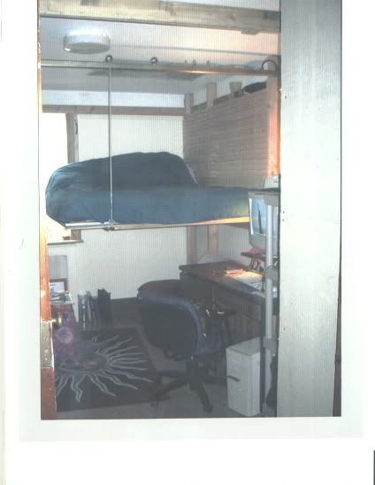
-But in order to build this bed you have to incorperate -DIAGRAM B-
-which is when you and your partner are kneeling in bed your head must not hit the ceiling. this is very important !!! dontcha think!
here you can tell that diagram b works out...
i have never actually put the diagram on paper
edward tufte on diagrams such as timelines, trees, networks, organizational charts, and the like:
"if your display looks like a knock-off from a corporate annual report or a powerpoint pitch, start over. designs for analytical diagrams should be clear, efficient, undecorated, maplike; the content should be intense, explanatory, evidential, maplike. the metaphor is the map, not stupidity."
D I M E N S I O N O F T I M E B Y K. D I C K R A N.
EXPLOSION [BIG BANG] OR IMPLOSION OF SWASTIKA.
UNITY-IN-DIVERSITY AND DIVERSITY-IN-UNITY.
EACH TRIANGLE IS INTERCONNECTED WITHIN A L L OTHERS
CONTAINING IN THEM IN LARGER OR SMALLER SCALE...
...NEVER CHANGING ITS PRIMAL TRIANGLE FORM.
THE GREAT PYRAMID. UNFOLDED.
remmy has an diagram of the seattle public library unfolded. i'll try to find it.
[url=http://www.mnftiu.cc/mnftiu.cc/adventures_dr_phil.html]the healing double helix[/img]
dang. trying again:
the healing double helix
one thing about the way that architects have been presenting information lately though is that i feel that a lot of the diagrams, charts, and graphs i see are more compelling in just the visual wash of the presentation than the information that they present or the way they present it. i've literally watched students spend days copying a simple chart from a book into rhino because they were trying to up the cool factor of something that could also just be incredibly simple. if the information is presented in an "unorthodox" manner which brings to light new possibilities on how information could be interpreted, then that's great, but a lot of the things i see these days are just graphically glorified diagrams that could easily be reproduced with microsoft excel.
check out the "RSVP cycles" by Halprin...totally off the chain
bossman- i agree, however I wonder if some times its not just a case of the diagram is cohrent to the maker and not the viewer. I have had this problem before - get so caught up in the making and loose the clarity.
i also agree bossman. tufte talks alot about this in his books.
24-7, the point of diagrams, most of the time, is to communicate information to others effectively. if it only speaks to you and not the audience that you are presenting the information to, how successful is the diagram? maybe we are saying the same thing?
e - we are saying the same thing.
hi,
can anyone post diagrams of CCTV and Seattle pulic library please/
Thanks
most of the original diagrams of Seattle Public Library from Rem's presentation. (it's flash, so I can't post the individual images easily...)
yesterday Hiromi Hosoya of Hosoya Schaefer Architects presented at the "JAPAN NOW" lecture in NYC (with Toyo Ito as Keynote Speaker) the following diagrams. check the links to find the pdf-file:
http://www.hosoyaschaefer.com/pdf/hosoyaschaefer051223.pdf
http://www.hosoyaschaefer.com/seedamm_exhibition.htm
http://www.hosoyaschaefer.com/
Heather- glad to hear your swim cross the atlantic is over. great diagram!
Ah, that pac man chart has made my day!
great document pencrush, thanks a lot!
a diagram from thom mayne's sketchbook.
via
Block this user
Are you sure you want to block this user and hide all related comments throughout the site?
Archinect
This is your first comment on Archinect. Your comment will be visible once approved.