I have noticed that there as been a proliferation of renderings from well respected design firms that seem to have an extremely bright atmospheric effect in them. It's as if everyone has all of a sudden turned the brightness up until something in the image is completely washed out...
Is there a specific reasoning for this? Is it some new rendering software or setting that everyone has gotten excited about?
it could be that more render engines are including atmospheric and camera lens models/controls that simulate real-world light effects now (maxwell and Vray are examples)…if you're not careful you can accidentally get some pretty strong washed-out effects.
it also allows the renderings to be less detailed. I think that people have finally accepted that the renderings arent real life, so they have decided to go more artsy with them. Applying a filter or messing with the contrast/hue makes the renderings more of an artistic representation of the space than an attempted literal representation of it.
When I do renderings, I usually use the 'poster' filter in Photoshop to give my renderings a woodblock/poster quality to them. It makes them look a better than a rendering with no filter applied
I feel like it is intentional, designed to invoke a dream-like or hyper-real feeling...emotional. It's really the next step from photo-real and another example of architecture and film moving closer together. I'm seeing similar styles pop-up in student work as well. It's not always effective (as your examples demonstrate) but it is nice to see something different.
There is an office that does rendering like this and has pages of examples on their website but I can't recall the name. I think they are in LA.
to echo mdler and cherith, i think stylized is generally the way to go for representing design concepts as opposed to photorealism
they look good for one
they require less detail as noted for two
stylized is often more appropriate for conveying concepts for three
and in addition, photorealism is an art. there is not yet a render engine that just pops it out automatically (though perhaps maxwell render is close)
but if you ever search the forums on the main non-CAAD 3D modeling websites, where professional product visualization and arch viz people hang out, you'll notice that their background knowledge on use of light and color and texture often goes far beyond what we 'pick up' in school. To get photorealism they:
1 - study and are aware of the need to get certain qualities of light and shadow and color and AO and GI and blurry reflections, etc, etc, correct
2 - and if the program doesn't render them correctly in all parts of the image, which is often the case, they know how to either tweak the model, lighting, or textures to fake the correct way that light/color/texture would behave or they know how to correct in photoshop or aftereffects in a way that i don't believe most architects know how to do
Curves in photoshop unlike brightness, it brings out more visual info
Also developer eye candy realism started looking like this before firms were doing it, it makes every room seem like it will get that much light one day
Realsim takes serious effort, well the difference between almost real and real, like an A or a B grade.
I like to overlay stylized hidden line and realisn with multpile filters in photoshop and change the photoshop layer type so its nearly impossible to recreate without me telling you
I want someone to do a photo-real rendering that actually represents the reality of the project - sloppy construction details masked with furniture and plants, painted over graffiti and litter, a light coating of dust and debris rendering all white surfaces a vague shade of gray/beige and entourage that is not attractive, over-weight and poorly dressed.
Burn and dodge has been around since the advent of photography. There is no new rendering program that can produce this effect quicker than I can click on the photoshop mask and wax-on/ wax-off the hard lines of the drawing. That's all it is. I've seen our old renderer do it a million times.
As for WHY this has recently been adopted as a typical rendering style, that's open for debate.
it's because the HP color plotter makes everything look dark and dirty and if you don't crank up the brightness it looks like crap when you print out large scale.
As a non-practitioner (read, non-architect designer) I am glad to see a trend away from (the attempt at) photo-realism in renderings. Illustrations -- including photos -- of three-dimensional space and objects in that space, can never replicate the essence of (for instance) architecture, and (therefore) shouldn't try -- I'm beginning to think. Instead, they can tell the viewer some things about the project that can only be presented with line and color on a page ?
That may or may not begin to explain why I prefer (for instance) the outlines that surround objects in some traditional forms of illustration -- everything from Japanese block prints to classic juvenile fiction -- like those in this unfinished SketchUp model that a young beginner made last year.
When this fellow makes a video walk-through of his models, he deletes these outlines, which -- in league with the very primitive lighting in SketchUp -- leaves the viewer with not enough information about form to correctly and satisfyingly read the building. I realize this isn't a problem with more sophisticated software (and much more skilled drafters) but I still love the look of architecture rendered with these outlined forms.
Here are a couple of block prints by Hasui that show the same quality.
I also think that the more artistic renderings release the architect/designer/developer from having to establish a material pallet early on. Many renderings are used to raise capital, and the budget/material pallet is all over the place at this stage
it's the archviz equivalent of glamor shots! just slap enough vaseline on the lens and you can make any building look good.
---
That's essentially what I was thinking but you put it into words perfectly.
SDR, like you, I would prefer the Japanese prints any day. The character inherent in these simple prints blows away all the so-called technical renderings of today. Stare at the bottom print for 2 seconds, then scroll up to any of the computer generations above. For all the time and money put into them, they just seem shallow in comparison, don't they? For all the high-tech atmospheric effect we have discussed they strive for, a simple well-placed shadow and tree partially obscuring the offset subject in the bottom print accomplishes the interest, mystery, and curiosity that the above renderings can't. Granted, this is the work of a master, but it just goes to show that for many aspects of representation, the latest state of the art tools are vastly overrated. It's a shame, really. One of the biggest reasons I pursued architecture was for illustrative opportunities. And it's kind of disappointed me on this front. There is little time for craft and I tend to think we are all a little too hung up on non-substantial b.s. Like I've said before, we're so busy annually chasing the latest software, few of us ever fulfill our potential.
"For all the time and money put into them, they just seem shallow in comparison, don't they?"
Except that woodcut prints are entirely more expensive than a render.
Like someone pointed out above, renders are marketing devices for "stakeholders"-- neighbors, commissioners, bankers, investors, planners et cetera.
Sure, you can accomplish basic communication with either traditional media and computer-generated media... but it really comes down to tailoring. A planner may only really care about where your entrances or exits are located. Neighbors may only worry about the facade and where the windows or walls are. Investors want "lifestyle" shots they can sell.
The number of possible images needing to be made is mind-boggling for more complex projects. I certainly wouldn't want to pay the hefty price tag or spend the time waiting it would take for someone to hand illustrate 25 different views.
I will concede that SDR's examples convey far more information than many of the renderings, though.
Nouvel's rendering also expresses a lot of information, too. I can tell who ever wants that building is an asshole because it's obvious they're getting a surrounding height restriction due to the windows on the side of the building. That effectively stops the surrounding block from growing.
I don't tie method to content -- I'm certainly not advocating 12-block woodcuts or even gouache paintings. If someone can replicate the look of the above prints with a program, go to it. I'm advocating a return or retrenchment from photo-look renders, I guess.
1. Sexy. Sexy sells. Those images feel 'sexy' and create that emotional 'oooh, what's that?'
2. Time. Take a basic model, add light and do 90% of the work in Photoshop.
Most of those images aren't for marketing, ie sales, they are for competitions or that initial 'wow' effect that clients need early on.
I doubt you'll see images like that used to sell or lease space, at least not here in the US. While sexy, your average person that is looking to buy/lease will want to see what it really looks like, not a pretty image to hang on the wall.
This is kinda like the old ink/mylar collages of ages ago. Very sexy, worthy of being framed and put on a wall, but they won't do anything to help someone really understand what the wood floor is going to feel like on their bare feet.
I'm certainly not advocating we all switch to woodcuts! Haha.
Love the prints, SDR. Might have to search for a book of his.
"Nouvel's rendering also expresses a lot of information, too. I can tell who ever wants that building is an asshole because it's obvious they're getting a surrounding height restriction due to the windows on the side of the building. That effectively stops the surrounding block from growing"
Maybe there's a setback above the plinth or some kind of phase II demo or something? I give up.
I'd like to turn people's attention to the world beyond architecture: if you look at recent movies, music videos - they all have lots of light effects - this style is just representative of the wider visual trend, nothing to be over analytic about!
totally agree -- the effect of having the camera looking directly into the sun or other light source is certainly nothing new. it seems to be "hot" right now, but having your subject backlit and therefore washed out is probably as old as, you know, Caravaggio and the 1600's.
Such a informative thread. I do have similar feeling as OP has. The new style renderings look like from VRay, with full of light everywhere and softer contrast.
It's called "bloom". Many renderings can be quite flat. Adding bloom creates a depth to the rendering. Much of this is done in Photoshop so I don't think it's really a product of Vray or the like. And please, no flocks of seagulls in renderings.
cm - vray doesn't "make" images or styles, any rendering program (these days) is capable of similar results.
As ElG notes, it is a (mostly) post production technique.
Also note that it really depends on what the end market is. Much of the images here are for competitions, or early on in the design process, so minimizing details is a good strategy.
For someone looking to buy a place or for a city to invest, you'll see entirely different kind of images (more photographic, more detail, less "stylized").

current rendering trends
I have noticed that there as been a proliferation of renderings from well respected design firms that seem to have an extremely bright atmospheric effect in them. It's as if everyone has all of a sudden turned the brightness up until something in the image is completely washed out...


Is there a specific reasoning for this? Is it some new rendering software or setting that everyone has gotten excited about?
morphosis
rex
oma
jean nouvel
zaha
MAD
the list could keep going....
it could be that more render engines are including atmospheric and camera lens models/controls that simulate real-world light effects now (maxwell and Vray are examples)…if you're not careful you can accidentally get some pretty strong washed-out effects.
it also allows the renderings to be less detailed. I think that people have finally accepted that the renderings arent real life, so they have decided to go more artsy with them. Applying a filter or messing with the contrast/hue makes the renderings more of an artistic representation of the space than an attempted literal representation of it.
When I do renderings, I usually use the 'poster' filter in Photoshop to give my renderings a woodblock/poster quality to them. It makes them look a better than a rendering with no filter applied
I feel like it is intentional, designed to invoke a dream-like or hyper-real feeling...emotional. It's really the next step from photo-real and another example of architecture and film moving closer together. I'm seeing similar styles pop-up in student work as well. It's not always effective (as your examples demonstrate) but it is nice to see something different.
There is an office that does rendering like this and has pages of examples on their website but I can't recall the name. I think they are in LA.
i get a little more depressed when i see these and wonder, "why dont mine look like that?".
birds. everyone is putting flocks of birds in their renderings.
to echo mdler and cherith, i think stylized is generally the way to go for representing design concepts as opposed to photorealism
they look good for one
they require less detail as noted for two
stylized is often more appropriate for conveying concepts for three
and in addition, photorealism is an art. there is not yet a render engine that just pops it out automatically (though perhaps maxwell render is close)
but if you ever search the forums on the main non-CAAD 3D modeling websites, where professional product visualization and arch viz people hang out, you'll notice that their background knowledge on use of light and color and texture often goes far beyond what we 'pick up' in school. To get photorealism they:
1 - study and are aware of the need to get certain qualities of light and shadow and color and AO and GI and blurry reflections, etc, etc, correct
2 - and if the program doesn't render them correctly in all parts of the image, which is often the case, they know how to either tweak the model, lighting, or textures to fake the correct way that light/color/texture would behave or they know how to correct in photoshop or aftereffects in a way that i don't believe most architects know how to do
Curves in photoshop unlike brightness, it brings out more visual info
Also developer eye candy realism started looking like this before firms were doing it, it makes every room seem like it will get that much light one day
Realsim takes serious effort, well the difference between almost real and real, like an A or a B grade.
I like to overlay stylized hidden line and realisn with multpile filters in photoshop and change the photoshop layer type so its nearly impossible to recreate without me telling you
LASERS!!!!!!!!!!!!!!!!!!!!!!!!!!!!!!!!!!!!!!
I want someone to do a photo-real rendering that actually represents the reality of the project - sloppy construction details masked with furniture and plants, painted over graffiti and litter, a light coating of dust and debris rendering all white surfaces a vague shade of gray/beige and entourage that is not attractive, over-weight and poorly dressed.
Lasers - lens flare in photoshop
Cherith - I think you can find renderings like that on CG websites
Actually the brightness thing is probably a result of the exposure control, something not really available in rendering programs 5-10 years ago.
Lasers - lens flare in photoshop
Cherith - I think you can find renderings like that on CG websites
Actually the brightness thing is probably a result of the exposure control, something not really available in rendering programs 5-10 years ago.
Burn and dodge has been around since the advent of photography. There is no new rendering program that can produce this effect quicker than I can click on the photoshop mask and wax-on/ wax-off the hard lines of the drawing. That's all it is. I've seen our old renderer do it a million times.
As for WHY this has recently been adopted as a typical rendering style, that's open for debate.
trend
it's because the HP color plotter makes everything look dark and dirty and if you don't crank up the brightness it looks like crap when you print out large scale.
come on, guys, it's clearly the hand of god approving the design.
barkow leibinger

definitely a fan of the more subdued/artsy renderings than the awkward photo-realistic ones.
move toward the light...
it's the archviz equivalent of glamor shots! just slap enough vaseline on the lens and you can make any building look good.
Knew I would think of the office. Tons of examples of this style.
As a non-practitioner (read, non-architect designer) I am glad to see a trend away from (the attempt at) photo-realism in renderings. Illustrations -- including photos -- of three-dimensional space and objects in that space, can never replicate the essence of (for instance) architecture, and (therefore) shouldn't try -- I'm beginning to think. Instead, they can tell the viewer some things about the project that can only be presented with line and color on a page ?
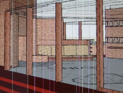

That may or may not begin to explain why I prefer (for instance) the outlines that surround objects in some traditional forms of illustration -- everything from Japanese block prints to classic juvenile fiction -- like those in this unfinished SketchUp model that a young beginner made last year.
When this fellow makes a video walk-through of his models, he deletes these outlines, which -- in league with the very primitive lighting in SketchUp -- leaves the viewer with not enough information about form to correctly and satisfyingly read the building. I realize this isn't a problem with more sophisticated software (and much more skilled drafters) but I still love the look of architecture rendered with these outlined forms.
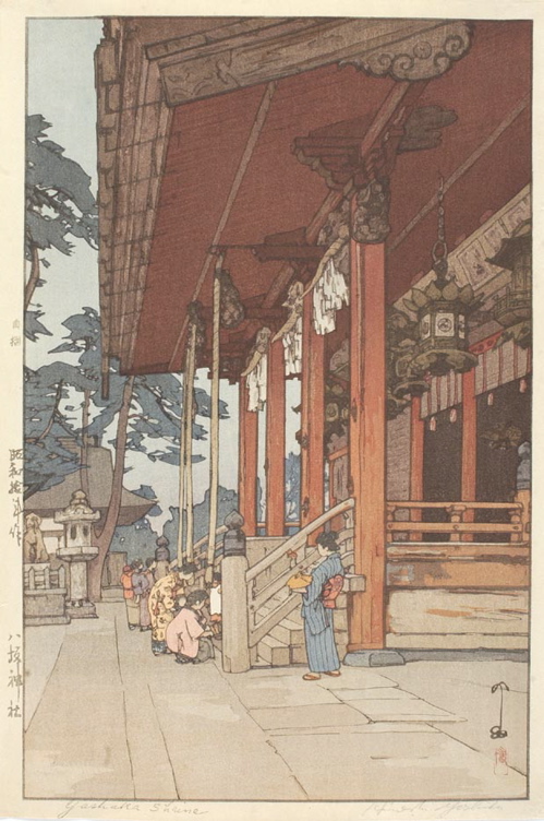
Here are a couple of block prints by Hasui that show the same quality.
I also think that the more artistic renderings release the architect/designer/developer from having to establish a material pallet early on. Many renderings are used to raise capital, and the budget/material pallet is all over the place at this stage
it's the archviz equivalent of glamor shots! just slap enough vaseline on the lens and you can make any building look good.
---
That's essentially what I was thinking but you put it into words perfectly.
SDR, like you, I would prefer the Japanese prints any day. The character inherent in these simple prints blows away all the so-called technical renderings of today. Stare at the bottom print for 2 seconds, then scroll up to any of the computer generations above. For all the time and money put into them, they just seem shallow in comparison, don't they? For all the high-tech atmospheric effect we have discussed they strive for, a simple well-placed shadow and tree partially obscuring the offset subject in the bottom print accomplishes the interest, mystery, and curiosity that the above renderings can't. Granted, this is the work of a master, but it just goes to show that for many aspects of representation, the latest state of the art tools are vastly overrated. It's a shame, really. One of the biggest reasons I pursued architecture was for illustrative opportunities. And it's kind of disappointed me on this front. There is little time for craft and I tend to think we are all a little too hung up on non-substantial b.s. Like I've said before, we're so busy annually chasing the latest software, few of us ever fulfill our potential.
"For all the time and money put into them, they just seem shallow in comparison, don't they?"
Except that woodcut prints are entirely more expensive than a render.
Like someone pointed out above, renders are marketing devices for "stakeholders"-- neighbors, commissioners, bankers, investors, planners et cetera.
Sure, you can accomplish basic communication with either traditional media and computer-generated media... but it really comes down to tailoring. A planner may only really care about where your entrances or exits are located. Neighbors may only worry about the facade and where the windows or walls are. Investors want "lifestyle" shots they can sell.
The number of possible images needing to be made is mind-boggling for more complex projects. I certainly wouldn't want to pay the hefty price tag or spend the time waiting it would take for someone to hand illustrate 25 different views.
I will concede that SDR's examples convey far more information than many of the renderings, though.
Nouvel's rendering also expresses a lot of information, too. I can tell who ever wants that building is an asshole because it's obvious they're getting a surrounding height restriction due to the windows on the side of the building. That effectively stops the surrounding block from growing.
They have a word for this in the developer biz: Blue Sky.
I don't tie method to content -- I'm certainly not advocating 12-block woodcuts or even gouache paintings. If someone can replicate the look of the above prints with a program, go to it. I'm advocating a return or retrenchment from photo-look renders, I guess.
A couple more, while I'm there:


T Yoshida (1911-1995)
Hasui (1883-1957)
Mostly covered so far...
1. Sexy. Sexy sells. Those images feel 'sexy' and create that emotional 'oooh, what's that?'
2. Time. Take a basic model, add light and do 90% of the work in Photoshop.
Most of those images aren't for marketing, ie sales, they are for competitions or that initial 'wow' effect that clients need early on.
I doubt you'll see images like that used to sell or lease space, at least not here in the US. While sexy, your average person that is looking to buy/lease will want to see what it really looks like, not a pretty image to hang on the wall.
This is kinda like the old ink/mylar collages of ages ago. Very sexy, worthy of being framed and put on a wall, but they won't do anything to help someone really understand what the wood floor is going to feel like on their bare feet.
You're talking about the digital images, or the "art" ones ?
I'm certainly not advocating we all switch to woodcuts! Haha.
Love the prints, SDR. Might have to search for a book of his.
"Nouvel's rendering also expresses a lot of information, too. I can tell who ever wants that building is an asshole because it's obvious they're getting a surrounding height restriction due to the windows on the side of the building. That effectively stops the surrounding block from growing"
Maybe there's a setback above the plinth or some kind of phase II demo or something? I give up.
don't get me started on the flocks of birds...
I found all these prints online, at sites specializing in Japanese prints. One of the sites provided multiple levels of enlargement . . .
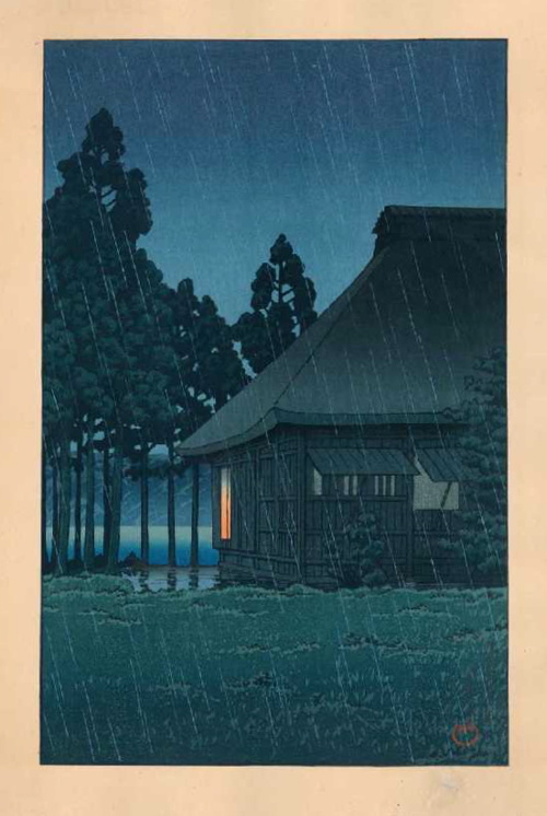


Four more Hasui. I think these were all done c. the 'thirties.
I'd like to turn people's attention to the world beyond architecture: if you look at recent movies, music videos - they all have lots of light effects - this style is just representative of the wider visual trend, nothing to be over analytic about!
Yup, very true. Just look at 300 and the onslaught of comic book movies.


Personally, I find the 'style' quite beautiful.
@own good point
@ own1221:
totally agree -- the effect of having the camera looking directly into the sun or other light source is certainly nothing new. it seems to be "hot" right now, but having your subject backlit and therefore washed out is probably as old as, you know, Caravaggio and the 1600's.
Backlighting = less detail shown + way to hide deficiencies = less hours spent on rendering. It's simply a sign of the times of low budgets.
As they say, Doctor's bury their mistakes, Architects hide them with trees. Or in this case, sun spots and lens flare.
All of the OP's image examples are all clearly plagiarism as plagiarism defined by this board is imitating style.
What ever looks the most prettiest is the trend!
Such a informative thread. I do have similar feeling as OP has. The new style renderings look like from VRay, with full of light everywhere and softer contrast.
Like french girls, beautiful!
Perhaps the intense glare that these buildings cause is finally being addressed.
It's called "bloom". Many renderings can be quite flat. Adding bloom creates a depth to the rendering. Much of this is done in Photoshop so I don't think it's really a product of Vray or the like. And please, no flocks of seagulls in renderings.
cm - vray doesn't "make" images or styles, any rendering program (these days) is capable of similar results.
As ElG notes, it is a (mostly) post production technique.
Also note that it really depends on what the end market is. Much of the images here are for competitions, or early on in the design process, so minimizing details is a good strategy.
For someone looking to buy a place or for a city to invest, you'll see entirely different kind of images (more photographic, more detail, less "stylized").
El: thank you very much!
http://www.oferz.com/Tutorials/BloomEffect/BloomEffect.html
trace: it is indeed a good technique to hide the details in the early stage. Do you happen to have some online tutorial to recommend for this effect?
Block this user
Are you sure you want to block this user and hide all related comments throughout the site?
Archinect
This is your first comment on Archinect. Your comment will be visible once approved.